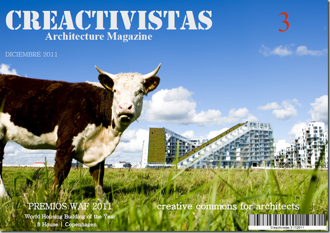
La licencia de Creative Commons para arquitectos puede ser una herramienta eficaz para enriquecer los proyectos de arquitectura, el diseño de ciudades y en general cualquier ejecución. El exceso de localismo y de la protección de los mismos ha originado un enfoque repetitivo que empobrece la enorme riqueza diversa de creatividad, innovación e investigación a los que se someten estudios de todo el mundo. En el presente numero nos adentramos en la parte conceptual y traemos ejemplos de como el futuro puede ser compartido sin miedo a perder el protagonismo del arquitecto.
Traemos un extenso reportaje con los premios de la World Architecture Festival celebrado de Barcelona el pasado mes de Noviembre del 2011.
![]()
La licencia de Copyright en Creative Commons adquiere una naturaleza de potencialidad ilimitada transferida a un sistema tan protegido como la arquitectura. Nos referimos a ello en su dimensión técnica de reproducir proyectos con todos sus contenidos o partes de él.
El diseño, la moda, marcas, ideas o conceptos son habitualmente copiados hasta la saciedad. La arquitectura no podía substraerse a esa capacidad innata del ser humano de plagiar. La humanidad a través de la utilidad ha dado pie a elementos y esquemas que daban el poder a unos pocos en beneficio de contar con una tecnología segura y útil. Estas se han trasladado al ámbito de la organización social, el pensamiento y la religión como valores doctrinarios y han perdurado en algunos casos por los siglos. En otros, las tendencias han marcado mercados como la moda, edades o las propias celebraciones de navidad. También la moralidad y la fé frente a sucesos trascendentes supone un gran negocio, lo que implica que todavía seguimos anclados en una sociedad devocional y que no presta atención a aspectos sutiles de la tecnología ya ampliamente demostradas por la psicología moderna. Recordemos que las primeras prendas de vestir cumplían una función higiénica y de protección frente al frio, no la de tapar nuestras vergüenzas.
La arquitectura comienza a ser foco de atención en el momento en que la eficacia y gustos de determinados segmentos de mercado se inclinan a demandar productos iguales, podríamos decir que un caso similar seria el mercado de automóviles donde las personas se inclinan a determinadas marcas o modelos una vez lo han visto en funcionamiento. Se trata –salvando las distancias- de vivir la experiencia de la arquitectura para demandar un determinado prototipo. Es habitual ir a casa de un amigo y querer una casa del mismo arquitecto o hacer fotos para inspirarse en cosas que nos gustaron de determinados diseños. Cuando no documentarse a través de revistas o libros. La revolución digital de un mundo global hará el resto que nos queda por recorrer.
Los sistemas monopolísticos y restrictivos que provienen de la época medieval en muchos países como España o Italia donde determinados cánones aun conservan el bigote de sus ancestros, si bien será arrancado de cuajo en un tirón a golpe de esparadrapo por la propia imposición de las generaciones nuevas. Todo esto es porque la tecnología digital de prestación de servicios está superando a la artesanal y lo que el Cad significó en su día hoy es ya un hecho con nuevos retoques de operatividad del mercado digital de prestación de servicios.
![]()
![clip_image002[1] clip_image002[1]](http://lh5.ggpht.com/-u8WW2XvWK4A/Ttfcl1umXRI/AAAAAAAABzg/1WpP-34ypbw/clip_image002%25255B1%25255D_thumb%25255B1%25255D.png?imgmax=800)
Nos interesa abrir un debate sobre CC, es lo que por defecto ocurrirá mas pronto que tarde. No por propia vanidad ya que existen fervorosos defensores de proyectos en licencia abiertas con fuerza y evidencia contrastada. Sino por las variables que pudieran extenderse en un sector tan singular. Sobre todo por la orientación que debería darse para impulsar el mercado tan competitivo y en algunos casos quebrado en el que se ha convertido el mundo inmobiliario. No se trata por tanto de restar sino de potenciar lo que hasta hace poco era cómodo para muchos y cuando copiar -bien- es cuanto menos oportuno.
SOBRE
CREATIVE
COMMONS
La idea del acceso universal a la investigación, la educación y la cultura es posible gracias a Internet, pero nuestros sistemas legales y sociales no siempre permiten que esa idea pueda hacerse realidad. El copyright fue creado mucho antes de la aparición de Internet, y puede hacer que sea muy difícil llevar a cabo legalmente acciones que damos por sentadas en la Red: copiar, pegar, editar la fuente y publicar en la Web.
La configuración por defecto de la ley de derechos de autor requiere que todas estas acciones cuenten con autorización expresa, otorgada de antemano, si eres un artista, maestro, científico, bibliotecario, un responsable de la administración, o simplemente un usuario normal. Para lograr la visión de acceso universal, alguien tenía que proporcionar una infraestructura pública, gratuita y estandarizada que creara un equilibrio entre la realidad de Internet y la realidad de las leyes de copyright. Ese alguien es Creative Commons”.
Creative Commons comenzó a ofrecer licencias para compartir contenidos abiertamente hace solo una década. En la actualidad más de 400 millones de obras con licencias CC se encuentran disponibles en internet, desde música y fotografías, hasta resultados de investigación y cursos universitarios completos. Creative Commons creó la infraestructura técnica y legal que permite el intercambio e_caz de conocimiento, arte y datos por parte de individuos, organizaciones y gobiernos. Y lo que es más importante, millones de creadores han aprovechado esa infraestructura para compartir obras que enriquecen el procomún mundial de la humanidad.
![]()
![clip_image002[3] clip_image002[3]](http://lh4.ggpht.com/-BRShjY6B7HQ/Ttfcoss2tMI/AAAAAAAAB0A/-Non5ZPruRs/clip_image002%25255B3%25255D_thumb%25255B1%25255D.png?imgmax=800)
English
Download Other lenguajes: http://thepowerofopen.org/downloads/
![]()
![clip_image002[6] clip_image002[6]](http://lh5.ggpht.com/-BYltFx7pMfk/Ttfcul1XuxI/AAAAAAAAB0g/d4VrBqFpUz0/clip_image0026_thumb1.png?imgmax=800)
En lugar de permitir que los diseñadores decidan el aspecto de su próximo prototipo de automóvil, la empresa Fiat abrió una convocatoria pública de ideas. En poco más de un año, más de dos millones de personas provenientes de 160 países visitaron la web de diseño del Mio y aportaron 10.000 ideas únicas sobre aspectos clave como la propulsión, la seguridad, el diseño, los materiales y el entretenimiento. Todas las ideas fueron publicadas y puestas a disposición del resto del mundo bajo licencias Creative Commons.
“Estamos llevando la interacción a su máximo nivel y revolucionando nuestra forma de pensar sobre proyectos futuros para poder comprender sus necesidades y cambiar el modo tradicional de pensar de la industria automovilística”, dice João Batista Ciaco, director de publicidad y marketing relacional de la empresa Fiat.
El resultado de esta apertura y cooperación es un prototipo de coche único. El Mio es un vehículo del tamaño de un coche inteligente, con ruedas que giran 90 grados, parabrisas que se adaptan a distintas condiciones climáticas y sistema de recuperación de energía cinética, eólica y solar. Dado que el prototipo tiene una licencia Creative Commons, cualquiera puede incorporar estas ideas en su trabajo futuro, desde artistas plásticos y diseñadores hasta compañías automovilísticas de la competencia. Al igual que la mayoría de los prototipos de automóvil, el Mio posiblemente nunca entre en producción, pero es probable que se incorporen las innovaciones y el rumbo sugerido en los próximos diseños de Fiat. Además, gracias a la licencia CC, estas buenas ideas pueden extenderse libremente por toda la industria automovilística.
MÁS INFO
http://www.fiatmio.cc
![clip_image002[8] clip_image002[8]](http://lh6.ggpht.com/-NgD5gyujKEE/Ttfcx9wr_yI/AAAAAAAAB0w/kqJQ0mobUGs/clip_image0028_thumb2.png?imgmax=800)
El premiado cineasta Vincent Moon es una especie de nómada. No tiene hogar ni demasiadas posesiones: tan solo algo de ropa, libros, unos pocos discos duros, equipo de grabación y un viejo ordenador portátil. Pero Moon posee un talento incomparable para realizar películas musicales de ensueño. Todas las obras originales de Moon se estrenan bajo una licencia BY-NC-SA de Creative Commons, de modo que cualquier persona puede compartirlas o remezclarlas siempre y cuando se otorgue el debido reconocimiento y no se use para fines comerciales. “Es como si viviera mi vida bajo una licencia Creative Commons”, comenta, poniendo énfasis en su participación activa en la economía de compartir que CC contribuye a hacer posible. “Hago películas a cambio de un lugar donde quedarme y algo de comida. Mis películas son un pretexto para conocer personas, viajar y aprender; la cámara es mi herramienta social”. Desde que comenzó con este estilo de vida hace dos años, la vida de este hombre de 31 años tomó la dirección contraria al romance fallido que inicialmente le llevó a emprender el camino. Su película La Faute Des Fleurs del año 2009 ganó el Premio de Sonido y Visión en el Festival Internacional de Documentales de Copenhague y su serie Take Away Show, en la que documenta abiertamente a músicos de todo el mundo, tiene un éxito enorme en YouTube.
En la actualidad, Moon se encuentra desarrollando un nuevo proyecto denominado Petite Planetes que recopila grabaciones audiovisuales de sus viajes. “Estoy en una búsqueda alrededor del mundo para intentar redefinir la posición del ‘creador’ en nuestra generación. La licencia CC es una parte muy importante de todo esto”.
MÁS INFO
http://www.vincentmoon.com

After training as an architect, Cameron Sinclair (then age 24) joined Kate Stohr to found Architecture for Humanity, a nonprofit that helps architects apply their skills to humanitarian efforts. Starting with just $700 and a simple web site in 1999, AFH has grown into an international hub for humanitarian design, offering innovative solutions to housing problems in all corners of the globe.
Whether rebuilding earthquake-ravaged Bam in Iran, designing a soccer field doubling as an HIV/AIDS clinic in Africa, housing refugees on the Afghan border, or helping Katrina victims rebuild, Architecture for Humanity works by Sinclair’s mantra: «Design like you give a damn.» (Sinclair and Stohr cowrote a book by the same name, released in 2006.)
A regular contributor to the sustainability blog Worldchanging.com, Sinclair is now working on the Open Architecture Network, born from the wish he made when he accepted the 2006 TED Prize: to build a global, open-source network where architects, governments and NGOs can share and implement design plans to house the world.
«Cameron Sinclair is doing his best to save the world, one emergency shelter and mobile AIDS clinic at a time.»
Washington Post
Larry Lessig: Lawyer, activist
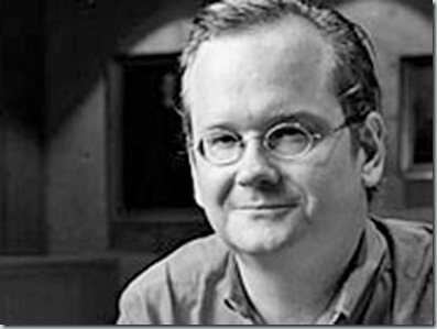
Harvard professor Larry Lessig is one of our foremost authorities on copyright issues, with a vision for reconciling creative freedom with marketplace competition.
Larry Lessig, el abogado más conocido de la Red, cita a John Philip Sousa, derechos de propiedad celestial y el «cártel ASCAP» en su argumento para revivir nuestra cultura creativa.
No expert has brought as much fresh thinking to the field of contemporary copyright law as has Lawrence Lessig. A Harvard professor and founder of Stanford’s Center for Internet and Society, this fiery believer foresaw the response a threatened content industry would have to digital technology — and he came to the aid of the citizenry.
As corporate interests have sought to rein in the forces of Napster and YouTube, Lessig has fought back with argument — take his recent appearance before the U.S. Supreme Court, fighting the extension of copyright protection from 50 to 70 years — and with solutions: He chairs Creative Commons, a nuanced, free licensing scheme for individual creators.
Lessig possesses a rare combination of lawerly exactitude and impassioned love of the creative impulse. Applying both with equal dedication, he has become a true hero to artists, authors, scientists, coders and opiners everywhere.
http://lessig08.org/
«Lessig has built a reputation as the king of Internet law and as the most important next-wave thinker on intellectual property.»
New York Magazine
Timothy Horton (Australia)
5000+ Integrated Design Commissioner, Tim Horton talks about the integrated Design Strategy for inner Adelaide Architecture & Design
Timothy Horton has worked as an architect in Sydney, Canberra and Los Angeles, starting his professional career at the NSW Government Architects Office with its prestigious cadet program. Tim moved to South Australia in 2005 to work on a succession of award winning civic projects including Uni SA’s Hawke Building on North Terrace and the Adelaide Zoo Entrance Precinct and Giant Panda Bamboo Forest with HASSELL. Tim has served as Chair of the National Practice Committee of the Australian Institute of Architects, as the South Australia Chapter President, and a National Councillor until he was appointed Commissioner for Integrated Design by the Premier in July 2010.
Featuring Clark Brockman, SERA Architects; Alisdair McGregor, Arup; Bill Reed, Integrative Design Collaborative
Richard Baraniuk

Richard Baraniuk is founder of Connexions, a free, open-source, global clearinghouse of course materials. People in some 200 countries tap into its vast store of texts on everything from engineering to ornithology to music, adapting the content as they see fit.
Rice University professor Richard Baraniuk has a giant vision: to create a free global online education system that puts the power of creation and collaboration in the hands of teachers worldwide. He’s realizing that vision with Connexions, a website that allows teachers to quickly «create, rip, mix and burn» coursework — without fear of copyright violations. Think of it as Napster for education.
Connexions’ open-source system cuts out the textbook, allowing teachers to share course materials, modify existing work and disseminate it to their students — all for free, thanks to Creative Commons licensing. Baraniuk envisions Connexions as a repository where the most up-to-date material can be shared and reviewed (it’s far more efficient than waiting for a textbook to be printed); it could become a powerful force in leveling the education playing field. Currently encompassing hundreds of online courses and used by a million people worldwide, Baraniuk’s virtual educational system is revolutionizing the way people teach and learn.
«[Connexions] is trying to reshape the way academe uses both peer review and publishing. The project also has hopes of becoming a major curricular tool at community colleges.»
Inside Higher Ed
Sustainable Affordable Housing
Open Source House aims to create sustainable and affordable housing for all with locally embedded design using natural materials. Including the wishes and needs of the end user and an assessment of the local current housing industry. The solutions are generated in the design competitions, are open source and are encouraged to be used by anyone to improve housing anywhere in any situation.
![clip_image002[1] clip_image002[1]](http://lh5.ggpht.com/-6jTOa2U0Lio/Tt5-g4F7gzI/AAAAAAAAC9M/AjrfmmJ2DAM/clip_image002%25255B1%25255D_thumb%25255B1%25255D.jpg?imgmax=800)
OS House Activites
· Start-up local companies to provide affordable/sustainable housing
· Organise competitions for new locations
· Stimulate local parties to use designs and adapt them to the local conditions
· Realise 100,000 OS-Houses before the year 2020!
Current Issues
OS House works from the top down and the bottom up, as an issue driven organisation. Rapid urbanisation, wastage of resources, global warming, inefficient construction methods and unshared ideas are all part of the underlying problem. Generating choice is a priority, and the platform is a place where knowledge and creativity come together to address these issues.
http://os-house.org/english/os-house/Home
Nuevas terminologías referentes a los derechos que corresponden por ser autor de un proyecto circularan por la red como Copylef, Creative Commons, Licencia de Autor Libre de Derechos, Open Source, Se Permite Copiar (SPC) y otros muchos.
En el caso español son los propios Colegios Profesionales los que se encargan de esta labor sin perjuicio de la defensa ante los propios Tribunales de los derechos inherentes al autor del proyecto y que este no se pueda copiar.
La protección de derechos comienza a ser -no solo innecesaria- porque realmente se copia en abundancia en un sector ampliamente consentido, donde los estilos, la “savia” de los proyectos se trasladan de uno en otro proyecto cuando no se definen módulos preconfigurados en una simple repetición de secuencias. Se copia, se plagia y sobre todo lo más abundante es que se repite hasta la saciedad. Hecho que es ampliamente demostrable con los denominados “pitufos” de nuestro nuevo paisaje urbanístico. Por no decir las repetitivas estructuras de edificios con ligeras variantes.
El mercado, la progresión especuladora, el aumento constante de los costes ha hecho llegar a un hartazgo de los consumidores en la configuración de forma y habitad de vida. Perdurará por siglos venideros en este mismo diseño para lo cual no solo no se ha generado el suficiente debate sino que existen serios desequilibrios de calidad entre proyectos muy pensados y otros que han sido improvisados, cuanto menos. Posiblemente los componentes de este diseño pudieron mejorarse con un adecuado sistema de contenidos de otros estudios que idearon una mejor solución a estas metódicas filas de casas adosadas sin más interés que las figuras geométricas que forman a vista de pájaro.
Nuestra propuesta utilizada ya por algunos estudios como algo novedoso puede provocar un cambio de un rango revolucionario en el ámbito de la arquitectura unido a la era digital y las comunicaciones.
Cameron Sinclair ideó un proyecto de casas para un mundo en desarrollo a través de este concepto y ha sido ampliamente seguido por muchos apoyos para llevar soluciones para un mundo en constate necesidad de ideas frescas. Sobre todo en las zonas donde el desarrollo consiste en tener unas condiciones mínimas de habitabilidad.
Pero no se trata solo de frecuentar estas figuras en licencia libre en proyectos de desarrollo sino en la mas variadas formulas de ingeniería para casas de baja emisión, mobiliarios urbanos o determinados detalles de ejecución. Algunos dirán que son las propias marcas las que desde hace mucho tiempo están prestando su apoyo técnico a la elaboración del proyecto a modo de detalles o la propia imposición en la memoria del proyecto. No queremos alarmar pero esto va mucho mas allá. Pronto veremos como se podrá comprar un proyecto -en Prêt-à-porter- de casa Ghery o Foster con un simple download y a bajo precio. Es solo un detalle de lo que supone la revolución.
La complejidad que comienzan a tener los más simples proyectos distan mucho de aquellos dibujos en dos laminas en las que los más insignes arquitectos de principios de XX firmaban sus proyectos de ejecución. Las llamadas extensas “tripas” del proyecto comienza a ser una demanda de interés para el presupuesto de ejecución y en la mayoría de los casos intervienen ingenieros, sociólogos, artistas, artesanos, abogados, psicólogos y en general personas que pueden contribuir a un mejoramiento del mismo. Caso más singular cuando se trata de un proyecto de urbanización. Sin con ello menoscabar el papel del arquitecto que se convierte en un “Director de Proyecto” como diseñador del mismo y coordinador de las partes especializadas.
El resultado serian proyectos híbridos donde todo el mundo se beneficiaria de las nuevas tecnologías más avanzadas en viviendas sostenibles, diseños ecoeficientes o simplemente reproducir un proyecto en cualquier parte del mundo con la firma de un arquitecto local como responsable de la ejecución de éste en licencia CC. Con las condiciones que permite este tipo de licencia. Las ideas sobre este tipo de liberación podría hacer revolucionar la arquitectura en beneficio de todos y también implicaría una mejor y eficaz atención a la ejecución del proyecto. Algunas opiniones al respecto:
-Domenico de Ecosistema Urbanos:
En arquitectura se copia….. y mucho. Entonces porque no hacerlo de manera útil y organizada?
Copiar hoy en día sigue teniendo una connotación negativa, sin embargo no tiene porque ser así. Copiar puede ser extremamente positivo, si se hace de manera inteligente y organizada. En otros campos se copia y se permite copiar constantemente. Por ejemplo al mundo del software y de internet, no es raro encontrar códigos de programas bajo una licencia (open source) que permite su libre uso (se permite copiar). Esto permite crear una red de desarrolladores que trabajan para mejorar el programa e incluso cambiarlo para adaptarlo a diferentes usos. De esta manera los trabajos de todos se suman y no se ponen en competición.
http://ecosistemaurbano.org/ecosistema-urbano/licencias-creative-commons-aplicadas-a-nuestros-proyectos/
-JOSÉ FARIÑA TOJO, Catedrático de Urbanismo y Ordenación del Territorio. Univ. Politécnica de Madrid
Hace años me preocupa un fenómeno que se viene agudizando de forma muy notable últimamente y que, entiendo, está relacionado con el significado del término cultura. Se trata de la progresiva apropiación del conocimiento humano en beneficio de unos pocos. Algunos lo llaman de derechos de autor.
http://elblogdefarina.blogspot.com/2008/10/arquitectura-imagen-y-derechos-de-autor.html
-El proyecto de Cameron Sinclair de recursos abiertos de arquitectura. Cuanto tenia 24 años, Kate Stohr y él fundaron una organización para que arquitectos y diseñadores se involucraran en el trabajo humanitario. No sólo para responder a desastres naturales, pero también para involucrarse en problemas sistémicos. Creían que dónde los recursos y la experiencia son escasos, la innovación y diseño sostenible pueden cambiar la vida de las personas.
http://openarchitecturenetwork.org/
“LA PROPIEDAD INTELECTUAL DE LOS ARQUITECTOS” por Arasa & De Miguel Abogados
Hace unos meses un cliente me pedía consejo legal al ser contratado como arquitecto para proyectar un edificio con vocación de obtener la categoría de emblemático. Las dudas y las inquietudes que justificaban la solicitud de asesoramiento tenían su origen más en el aspecto creativo y de autor, que no en las connotaciones económicas del contrato. La faceta que más inquietaba al facultativo no era asegurarse el cobro del precio de su proyecto, sino garantizar la paternidad de su obra, lo que se reflejaba en unas preguntas muy concretas: ¿ La legislación española sobre Propiedad Intelectual protege el proyecto del arquitecto y/o la obra finalmente resultante? ¿La protección incluye la facultad del arquitecto de oponerse a futuras modificaciones sobre la obra finalizada que puedan desnaturalizar la misma, por lo menos según su criterio de autor?
http://www.aradem.com/node/422
![clip_image002[3] clip_image002[3]](http://lh4.ggpht.com/-BX0yMTpqPMY/Tt5-iTnk1QI/AAAAAAAAC9g/vKSozJ4CN2o/clip_image002%25255B3%25255D_thumb%25255B1%25255D.jpg?imgmax=800)
![]()
Award World Architecture Festival 2011 ‘super-jury’
![clip_image002[16] clip_image002[16]](http://lh5.ggpht.com/-pOoUvsCGHqs/Ttfc7_XidDI/AAAAAAAAB2Q/aN2LcLfUa-M/clip_image00216_thumb2.jpg?imgmax=800)
![clip_image002[18] clip_image002[18]](http://lh3.ggpht.com/-A27qRiBvYEc/Ttfc9m7J8YI/AAAAAAAAB2c/NEFsXvYcYPo/clip_image00218_thumb1.jpg?imgmax=800)
Michael Sorkin, Principal of the Michael Sorkin Studio, New York;
Jo Noero, Principal of Noero Wolff Architects, Cape Town;
Odile Decq, Principal of ODBC, Paris;
Professor Kongjian Yu, Principal of Turenscape, Beijing, a double category winner in previous WAF awards
![]()
![clip_image002[10] clip_image002[10]](http://lh5.ggpht.com/-y3WOg_qjQUk/TtfdAVIgFFI/AAAAAAAAB28/DDG6TcvHtfQ/clip_image00210_thumb1.png?imgmax=800)
![clip_image001[5] clip_image001[5]](http://lh3.ggpht.com/-YNApVjqrqnI/TtfdA9oAccI/AAAAAAAAB3E/NKsaZd1IiK8/clip_image00154.png?imgmax=800)
![]()
Award World Architecture Festival 2011—Housing
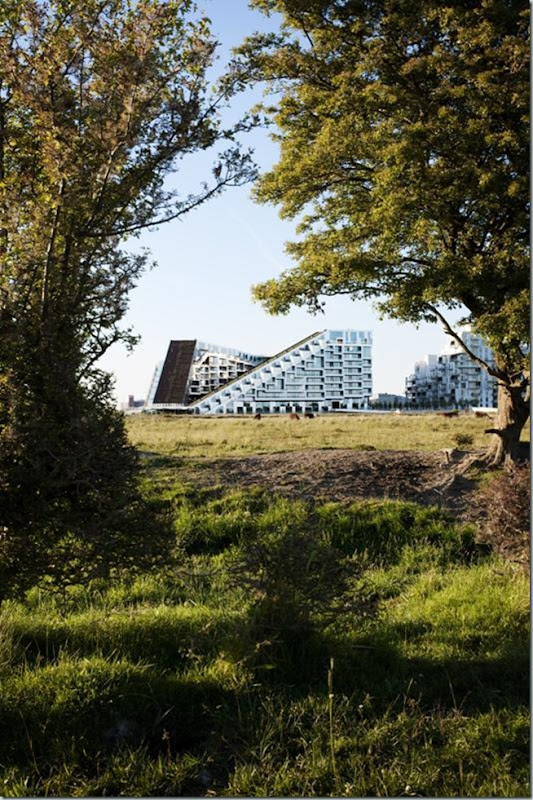
![clip_image001[7] clip_image001[7]](http://lh5.ggpht.com/-DT1uJCZlNX8/TtfdIZ5YhYI/AAAAAAAAC9w/-pBMRGlC10w/clip_image0017_thumb%25255B1%25255D.png?imgmax=800)
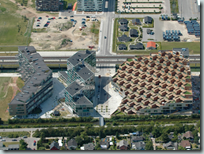
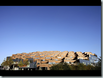
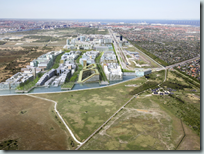
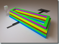
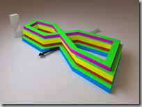
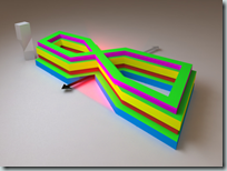
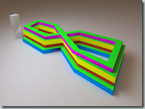
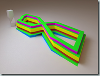
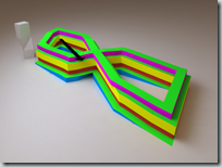
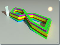
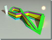
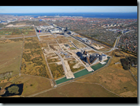
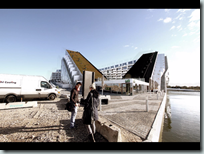
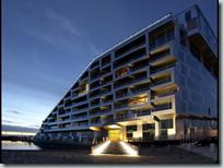
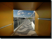
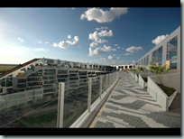
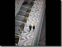
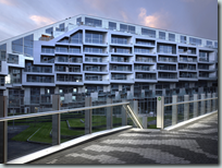
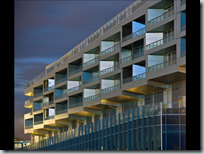
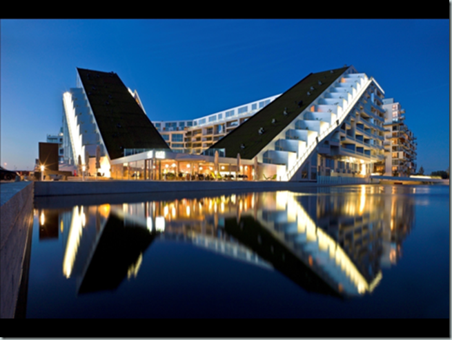
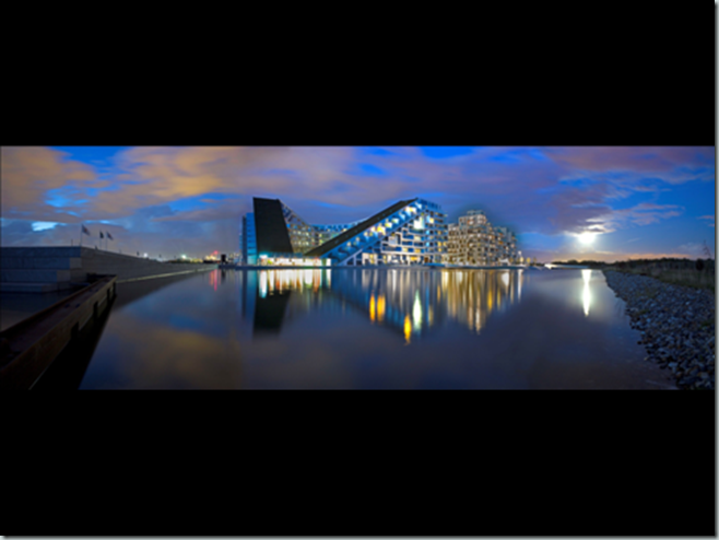
With spectacular views towards the Copenhagen Canal and over Kalvebod Fælled’s protected open spaces, 8 House will not only be offering residences to people in all of life’s stages as well as office spaces to the city’s business and trade – it will also serve as a house that allows people to cycle all the way from the ground floor to the top, moving alongside townhouses with gardens winding through an urban perimeter block.
Client / Developer
St. Frederikslund
Denmark
Environmental Engineer
Moe & Brødsgaard
Denmark
Landscape Architect
KLAR
Denmark
Structural Engineer
Moe & Brødsgaard
Denmark
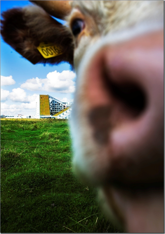
Can you imagine cycling up to your penthouse loft?
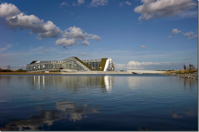
With spectacular views towards the Copenhagen Canal and over Kalvebod Fælled’s protected, open spaces, 8 House will not only be offering residences to people in all of life’s stages as well as office spaces to the city’s business and trade – it will also serve as a house that allows people to bike all the way from the ground floor to the top, moving alongside townhouses with gardens winding through an urban perimeter block.
8 House’ 50,000 m2 accommodates 540 residential units. The base consists of 10,000 m2 businesses, spread out at street level alongside the surrounding main streets, and at the Northern court yard that houses an office building. 8 House is partly for rent housing and partly residential property varying from 65 to 144 m2.
![clip_image002[25] clip_image002[25]](http://lh3.ggpht.com/-xXpShRgh7LQ/TtfdUzT8z3I/AAAAAAAAB4o/YqPN6HEs4kU/clip_image00225_thumb1.jpg?imgmax=800)
![clip_image002[27] clip_image002[27]](http://lh5.ggpht.com/-PGwN57tRzTI/TtfdXKBVPGI/AAAAAAAAB44/-x_MrKXd4ds/clip_image00227_thumb2.jpg?imgmax=800)
![clip_image002[29] clip_image002[29]](http://lh6.ggpht.com/-f1Zy3_FGkG0/TtfdZHz-sJI/AAAAAAAAB5E/32CCIRQDPIg/clip_image00229_thumb11.jpg?imgmax=800)
![clip_image002[31] clip_image002[31]](http://lh3.ggpht.com/-EtyygCym-i8/TtfdbG3fUKI/AAAAAAAAB5Y/SLbWzJoK-QU/clip_image00231_thumb1.jpg?imgmax=800)
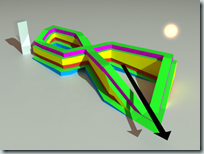
Two sloping green roofs totaling 1,700 m2 are strategically placed to reduce the urban heat island effect as well as providing the visual identity to the project and tying it back to the adjacent farmlands towards the south; 8 house is literally hoisted up in the Northeast corner and pushed down at the Southwest corner, allowing light and air to enter the southern courtyard – optimizing the daylight and natural heating for all inhabitants and users of the building and providing natural ventilation.
![clip_image002[33] clip_image002[33]](http://lh6.ggpht.com/-PoMmofSI2RE/TtfddvJoAHI/AAAAAAAAB5o/TebEIAfbeqY/clip_image00233_thumb3.jpg?imgmax=800)
8 House is where you will find the attention to detail embedded in a larger context. Here, closeness thrives in the 60,000 m2 building. This is where the tranquillity of suburban life goes hand in hand with the energy of a big city, where business and housing co-exist. 8 House is where common areas and facilities merge with personal life, and where you can reach for the stars at the top of the building’s green areas. The building’s housing program offers three kinds of accommodation: apartments of varied sizes, penthouses and townhouses. With a mix of suburban tranquillity and urban energy, the townhouse and its open housing is ideal for the modern family, while singles and couples may find the apartments more attractive. And for those who live life to the fullest, the penthouses function as a playground with fantastic views over the canal and Southern Copenhagen. The different housing typologies are united by the exterior dimensions which provide inspiration for adventures, inspiring communities. Partly inspired by classic townhouses as well as the open, democratic nature of functionalistic architecture.
![clip_image002[35] clip_image002[35]](http://lh3.ggpht.com/-gdMkjjHmUz0/Ttfdf8zs_mI/AAAAAAAAB54/Nt-wb3kGIz8/clip_image00235_thumb1.jpg?imgmax=800)
![clip_image002[37] clip_image002[37]](http://lh6.ggpht.com/-Euy6SeT8cdc/Ttfdh7E78RI/AAAAAAAAB6I/xqDBpcpeX5M/clip_image00237_thumb11.jpg?imgmax=800)
![clip_image002[39] clip_image002[39]](http://lh6.ggpht.com/-TzvSGmQ_Rt8/Ttfdka8JZRI/AAAAAAAAB6Y/JdKbElUbkVY/clip_image00239_thumb2.jpg?imgmax=800)
![clip_image002[41] clip_image002[41]](http://lh3.ggpht.com/-QFXbRU1ICI8/Ttfdm10QLmI/AAAAAAAAB6o/W9jCC-IIwX8/clip_image00241_thumb11.jpg?imgmax=800)
![clip_image002[43] clip_image002[43]](http://lh4.ggpht.com/-vMQzUdrh_Nc/Ttfdovk-YYI/AAAAAAAAB64/Db3FQDg3AqM/clip_image00243_thumb3.jpg?imgmax=800)
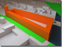
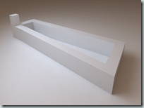
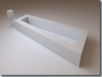
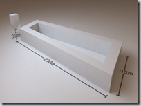
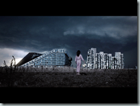
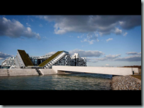
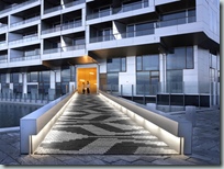
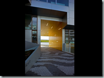
The architects have designed a long, coherent house with immense differences in height, creating a strong inflow of light and a unique local community with small gardens and pathways that channel your thoughts into mountains in Southern Europe and memories of a childhood home. The bow-shaped building creates two distinct spaces, separated by the centre of the bow which hosts the communal facilities of 500 m2. At the very same spot, the building is penetrated by a 9 meter wide passage that connects the two surrounding city spaces: the park area to the west and the channel area to the east. Instead of dividing the different functions of the building – for both habitation and trades – into separate blocks, the various functions have been spread out horizontally. The apartments are placed at the top while the commercial programme unfolds at the base of the building. As a result, the different horizontal layers have achieved a quality of their own: the apartments benefit from the view, sunlight and fresh air, while the office leases merge with life on the street.
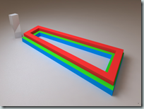
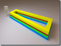
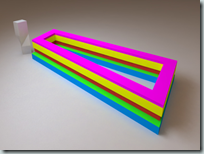
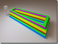



![]()
Award World Shopping Building of the Year
![clip_image002[45] clip_image002[45]](http://lh6.ggpht.com/-fp9BXf2_Wqg/TtfhF1PzOFI/AAAAAAAACHo/Xof5Dvqr9p0/clip_image00245_thumb11.jpg?imgmax=800)
![clip_image001[12] clip_image001[12]](http://lh4.ggpht.com/-rs-FZjjNEdM/TtfhHNVEfoI/AAAAAAAACH0/h9kLqKtklUo/clip_image00112_thumb.png?imgmax=800)
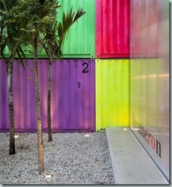
The showroom of the Decameron furniture store is located on a rented site in the furniture commercial alley in São Paulo. To make the quick and economic construction viable, the architect, worked with the premise of a light occupation combined with industrial elements, which could easily be assembled.
Architect
Mr Marcio Kogan
studio mk27
Brazil
Architect
Mrs Mariana Simas
studio mk27
Brazil
Client / Developer
Mr Marcus Ferreira
Decameron Design
Brazil
Environmental Engineer
studio mk27
Brazil
Interior Designer
Mrs Diana Radomysler
studio mk27
Brazil
Landscape Architect
Renata Tilli
Brazil
Structural Engineer
Poughet
Brazil
glass window frames
vitrocsa
Switzerland
polycarbonate window frames
kiko esquadrias
Brazil
sanitery faucets
interbagno
Brazil
Photograph by Pedro Vannucchi
![clip_image002[47] clip_image002[47]](http://lh3.ggpht.com/-W7anpC3rpKQ/TtfhI7ZYKSI/AAAAAAAACIE/weaeOxRiKB0/clip_image00247_thumb3.jpg?imgmax=800)
The showroom of the Decameron furniture store is located on a rented site in the furniture commercial alley in São Paulo. To make the quick and economic construction viable, the project worked with the premise of a light occupation of the lot, basically done with industrial elements, which could easily be assembled.
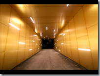
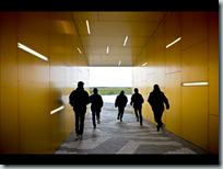
The space was constructed through a mixed solution, with maritime transport containers and a specifically designed structure. Despite the spatial limitation imposed by the pre-determined dimension of the containers, the piece has impressive structural attributes that makes piling them possible. Two stories of containers form tunnels where products are displayed side by side.
![clip_image002[49] clip_image002[49]](http://lh3.ggpht.com/-thUJFXZllLw/TtfhM7McUUI/AAAAAAAACIY/Yd3bpT5KJQQ/clip_image00249_thumb1.jpg?imgmax=800)
![clip_image002[51] clip_image002[51]](http://lh4.ggpht.com/-ajzywI4Mrl4/TtfhOmw66ZI/AAAAAAAACIo/X6Ef5d8YaVo/clip_image00251_thumb3.jpg?imgmax=800)
![clip_image002[53] clip_image002[53]](http://lh6.ggpht.com/-5HYx2aukz_k/TtfhSbmFZFI/AAAAAAAACJI/bLtM-s_qYzM/clip_image00253_thumb2.jpg?imgmax=800)
![clip_image004[6] clip_image004[6]](http://lh4.ggpht.com/-CsEncgH99aI/TtfhUDOo3uI/AAAAAAAACJY/P3jLXoA7xvE/clip_image0046_thumb2.jpg?imgmax=800)
![clip_image002[55] clip_image002[55]](http://lh4.ggpht.com/-qevIKD1wTh0/TtfhWA3QeNI/AAAAAAAACJo/54skOuTJpBc/clip_image00255_thumb1.jpg?imgmax=800)
![clip_image004[8] clip_image004[8]](http://lh3.ggpht.com/-JswDhlHsT24/TtfhYHzP3HI/AAAAAAAACJ0/3uHq0kzsFG4/clip_image0048_thumb1.jpg?imgmax=800)
![clip_image002[57] clip_image002[57]](http://lh4.ggpht.com/-69L03TROZeo/TtfhZiMCiKI/AAAAAAAACKI/5OCSg_DsAhw/clip_image00257_thumb1.jpg?imgmax=800)
![clip_image004[10] clip_image004[10]](http://lh3.ggpht.com/-nHq4ZXhVWB0/TtfhbnlV7uI/AAAAAAAACKY/tjklhuFl32k/clip_image00410_thumb1.jpg?imgmax=800)
![clip_image002[59] clip_image002[59]](http://lh5.ggpht.com/-nsU2UFbZSZs/TtfhdWHEP6I/AAAAAAAACKo/buMlV9mr6xc/clip_image00259_thumb4.jpg?imgmax=800)
![clip_image004[12] clip_image004[12]](http://lh5.ggpht.com/-qyS0L7GU3XI/TtfhfLnhTuI/AAAAAAAACK0/m5tzdnsEte0/clip_image00412_thumb3.jpg?imgmax=800)
![clip_image002[61] clip_image002[61]](http://lh5.ggpht.com/-om3bprhf6ZM/TtfhgRNEskI/AAAAAAAACLI/OxcfebXfEhk/clip_image00261_thumb1.jpg?imgmax=800)
![clip_image004[14] clip_image004[14]](http://lh3.ggpht.com/-fDJq_DQAykI/TtfhiNmvHZI/AAAAAAAACLY/ip6RCZ9YK0o/clip_image00414_thumb1.jpg?imgmax=800)
The ample span, necessary to show furniture in relation with each other, is constructed by a metallic structure. This space is closed, in front and in back, by double-height metal casements with alveolar polycarbonate. At the back of the lot, there is a patio filled with trees and a pebbled-ground. When both doors are simultaneously opened, the whole store becomes integrated with its urban context. At rush stressful hours, by opening only the back doors, the store becomes self-absorbed, ruled by the presence of the inner-garden.
On the back of the site is the office, closed by a glass wall that enables the designers to take part on the sales life. Two edges of the design process in contact through the inner patio as other opposing strengths also meet at this small project: The intensity of the urban life and a small nature retreat, the power of the containers and the lightness of the metallic structure and finally, the linearity of the tunnels and the cubic volume.
![clip_image002[63] clip_image002[63]](http://lh4.ggpht.com/-jLLKqN_dAwI/TtfhksFC3NI/AAAAAAAACLo/B9un5gXElRI/clip_image00263_thumb2.jpg?imgmax=800)
![clip_image004[16] clip_image004[16]](http://lh6.ggpht.com/-O0PpjtsB20I/Ttfhl9pjnVI/AAAAAAAACL4/AtN2h2cyEcs/clip_image00416_thumb1.jpg?imgmax=800)
![clip_image002[65] clip_image002[65]](http://lh6.ggpht.com/-iamgFDAQbs8/TtfhnLiGiAI/AAAAAAAACME/uUS2bgLdBpg/clip_image00265_thumb1%25255B1%25255D.jpg?imgmax=800)
![clip_image004[18] clip_image004[18]](http://lh6.ggpht.com/-uHw4DMR1qb4/TtfhosP4_PI/AAAAAAAACMU/9l65HdVQoig/clip_image00418_thumb1.jpg?imgmax=800)
![]()
Award World Architecture Festival 2011
World Display Building of the Year
![clip_image002[1] clip_image002[1]](http://lh3.ggpht.com/-yxoPGRe4paU/TtfhrfkaT4I/AAAAAAAACM4/dXyFesaPiGc/clip_image0021_thumb2.jpg?imgmax=800)
Norwegian Wild Reindeer Center Pavilion
Location Hjerkinn, Norway
Architect Snøhetta
Architect
Mr Erik Brett Jacobsen
Snøhetta
Norway
Architect
Mr Martin Brünner
Snøhetta
Norway
Architect
Mr Rune Grasdal
Snøhetta
Norway
Photograph by Klaas Van Ommeren, Knut Bjørgum and Jan Olav Storli
The Norwegian Wild Reindeer Centre Pavilion is located at Hjerkinn on the outskirts of Dovrefjell National Park, which rises 1200 metres above sea level and is home to Europe’s last wild reindeer herds and is the natural habitat for many rare plants and animals. The 90m² building, which features a rigid outer shell and an organic inner core is open to the public and serves as an observation pavilion for the Wild Reindeer Foundation educational programmes.
Architect
Mr Kjetil T. Thorsen
Snøhetta
Norway
+4791368953
kjetil@snohetta.com
Architect
Mrs Margit Tidemand Ruud
Snøhetta
Norway
+4790094733
margit@snohetta.com
Client / Developer
Mr Jo Skorem
Norsk villreinsenter Nord
Norway
+4795054755
jo.skorem@villrein.no
Contractor wood
Mr Lars Djupvaag
Djupvaag boat builders
Norway
lasse@djupevaag.no
Environmental Engineer
Mr Knut Bjørgum
Snøhetta
Norway
Interior Designer
Mrs Heidi Pettersvold
Snøhetta
Norway
Main Contractor
Prebygg AS
Norway
Project Manager
Mr Knut Bjørgum
Snøhetta
Norway
+4790924564
knut@snohetta.com
Structural Engineer
Mr Trond Gundersen
Dr.Techn. Kristoffer Apeland AS
Norway
trond.gundersen@kapeland.no
Sub contractor glass facade
Mr Erik Stening
Skandinaviske glass system
Sweden
erik.stening@skandglas.se
Sub contractor steel
Mr Bjørn Lonbakken
Lonbakken as
Norway
![clip_image002[3] clip_image002[3]](http://lh3.ggpht.com/-CVrT6KEehEs/TtfhtMWTKbI/AAAAAAAACNI/eUyPTWrMJbw/clip_image0023_thumb1.jpg?imgmax=800)
The Norwegian Wild Reindeer Centre Pavilion is located at Hjerkinn on the outskirts of Dovrefjell National Park, overlooking the Snøhetta mountain massif.
The 90m2 building is open to the public and serves as an observation pavilion for the Wild Reindeer Foundation educational programmes. A 1,5km nature path brings visitors to this spectacular site, 1200 meters above sea level.
Dovrefjell is a mountain range that forms a barrier between the norther and southern parts of Norway. It is home to Europe’s last wild reindeer herds and is the natural habitat for many rare plants and animals. Among the unique wildlife at Dovrefjell, the Musk Oxen herds are probably the main attractions for visitors. A long history filled with travellers, hunting traditions, mining, and military activities has left its mark on this land. In addition to the natural and cultural landscape, the Dovre mountain range also holds significant importance in the Norwegian consciousness. National legends, myths, poetry (Ibsen), music (Grieg), and pilgrimages celebrate the mystic and eternal qualities of this powerful place. The founding fathers of the Norwegian constitution are ”agreed and faithful, until the fall of Dovre!”
![clip_image004[1] clip_image004[1]](http://lh3.ggpht.com/-d8meWLGLa9E/Ttfhug3di6I/AAAAAAAACNY/crO7iyiDj0M/clip_image0041_thumb2%25255B1%25255D.jpg?imgmax=800)
![clip_image002[5] clip_image002[5]](http://lh6.ggpht.com/-iXnKaEGLvuE/Ttfhwovs4_I/AAAAAAAACNo/Cmr2yxWl6tY/clip_image0025_thumb1.jpg?imgmax=800)
This unique natural, cultural and mythical landscape has formed the basis of the architectural idea. The building design is based on a rigid outer shell and an organic inner core. Reminiscent of rock or ice eroded by wind and running water, the south facing exterior wall and the interior create a protected and warm gathering place, while still preserving the visitor’s view of the spectacular natural panorama.
Considerable emphasis is put on the quality and durability of the materials to withstand the harsh climate. The rectangular frame is made in raw steel resembling the iron ore found in the local bedrock. Over time the rusted colour blends with the natural colours in the sourrounding mountains.
The simple form and use of natural materials reference local building traditions.
However, advanced technologies have been utilized both in the design and the fabrication process. Using 3D computer models to drive the milling machines, Norwegian shipbuilders in Hardangerfjord have created the organic forms from 10 inch square pine beams. The wood was then assembled in a traditional way using only wood pegs as fasteners. The exterior wall was then treated with pine tar while the interior wood has been oiled.
The pavilion is a robust yet nuanced building that gives visitors an opportunity to reflect and contemplate this vast and rich landscape.
![clip_image002[7] clip_image002[7]](http://lh4.ggpht.com/-NZ8zvM78SrI/TtfhyjVeWzI/AAAAAAAACN4/6ZeV8QKO4Qs/clip_image0027_thumb1.jpg?imgmax=800)
![clip_image004[3] clip_image004[3]](http://lh5.ggpht.com/-EKTQQ2iO7vo/Ttfh0RQ8dLI/AAAAAAAACOI/eoAM9eIulpg/clip_image0043_thumb3.jpg?imgmax=800)
![clip_image002[9] clip_image002[9]](http://lh5.ggpht.com/-ETH4gAgPdfM/Ttfh1_Fq9GI/AAAAAAAACOY/8i8GBFVScp8/clip_image0029_thumb1.jpg?imgmax=800)
![clip_image004[5] clip_image004[5]](http://lh4.ggpht.com/-F8PTF3an2-4/Ttfh362BbVI/AAAAAAAACOo/YD7DGoomEZU/clip_image0045_thumb1%25255B1%25255D.jpg?imgmax=800)
![clip_image002[11] clip_image002[11]](http://lh6.ggpht.com/-J3aCV9Jkw1w/Ttfh5SsBfDI/AAAAAAAACO4/QHjs2vfTads/clip_image00211_thumb1.jpg?imgmax=800)
![clip_image004[7] clip_image004[7]](http://lh6.ggpht.com/-G5h34VEwVQA/Ttfh7sYI_3I/AAAAAAAACPI/v-ZA18JLyuo/clip_image0047_thumb2.jpg?imgmax=800)
![clip_image002[13] clip_image002[13]](http://lh5.ggpht.com/-MyIvhEYQo-U/Ttfh-I_pQOI/AAAAAAAACPY/q6NmdrhET9s/clip_image00213_thumb1.jpg?imgmax=800)
![clip_image004[9] clip_image004[9]](http://lh3.ggpht.com/-5GTGBLyZKmY/Ttfh_mhFZlI/AAAAAAAACPo/IMbIeKW6A1s/clip_image0049_thumb1.jpg?imgmax=800)
![]()
Award World Architecture Festival 2011
World Health Building of the Year
![clip_image002[15] clip_image002[15]](http://lh5.ggpht.com/-ypoexVFP4Ec/TtfiDkmv8KI/AAAAAAAACQI/6tz_oj80DdM/clip_image00215_thumb1.jpg?imgmax=800)
Rehabilitation centre Groot Klimmendaal
Photograph by Rob t Hart – Rob het Hart Fotography
In the undulating forest landscape around Arnhem in the eastern part of the Netherlands, revalidation centre ‘Groot Klimmendaal’ can be found standing as a quiet deer in between trees. From a small footprint, the building gradually fans out towards the top and cantilevers out over the surrounding terrain. The care concept is based on the idea that a positive and stimulating environment increases the well-being of patients and has a beneficial effect on their revalidation process. The design ambition was not to create a centre with the appearance of a health building but a building as a part of its surroundings and the community.
Location Arnhem, Netherlands
Architect Architectenbureau K van Velsen BV,
Hilversum, Netherlands
Architectenbureau K van Velsen BV
Hilversum
Netherlands
Architect
Mr Koen van Velsen
Architectenbureau K van Velsen BV
Netherlands
Client / Developer
Stichting Arnhems revalidatiecentrum Groot Klimmendaal
Netherlands
Environmental Engineer
Royal Haskoning RTB van Heugten
Netherlands
Main Contractor
BAM Utiliteitsbouw BV
Netherlands
Project Manager
Brinkgroep
Netherlands
Structural Engineer
DHV Building and Industry BV
Netherlands
![clip_image002[17] clip_image002[17]](http://lh5.ggpht.com/-UgUtPkFelbE/TtfiFEaN2iI/AAAAAAAACQY/-y2Nl8cFMFM/clip_image00217_thumb1%25255B1%25255D.jpg?imgmax=800)
![clip_image004[11] clip_image004[11]](http://lh6.ggpht.com/-pD3ZNzMQKwQ/TtfiHSkVZfI/AAAAAAAACQo/Ezd2mph75kQ/clip_image00411_thumb1.jpg?imgmax=800)
This unique natural, cultural and mythical landscape has formed the basis of the architectural idea. The building design is based on a rigid outer shell and an organic inner core. Reminiscent of rock or ice eroded by wind and running water, the south facing exterior wall and the interior create a protected and warm gathering place, while still preserving the visitor’s view of the spectacular natural panorama.
Considerable emphasis is put on the quality and durability of the materials to withstand the harsh climate. The rectangular frame is made in raw steel resembling the iron ore found in the local bedrock. Over time the rusted colour blends with the natural colours in the sourrounding mountains.
The simple form and use of natural materials reference local building traditions.
However, advanced technologies have been utilized both in the design and the fabrication process. Using 3D computer models to drive the milling machines, Norwegian shipbuilders in Hardangerfjord have created the organic forms from 10 inch square pine beams. The wood was then assembled in a traditional way using only wood pegs as fasteners. The exterior wall was then treated with pine tar while the interior wood has been oiled.
The pavilion is a robust yet nuanced building that gives visitors an opportunity to reflect and contemplate this vast and rich landscape.
![clip_image002[19] clip_image002[19]](http://lh4.ggpht.com/-W4ByboMUa6U/TtfiJvM6FYI/AAAAAAAACQ4/tPAhwGYxlZE/clip_image00219_thumb1.jpg?imgmax=800)
![clip_image002[21] clip_image002[21]](http://lh5.ggpht.com/-xkVGHkTufCc/TtfiLMqtJiI/AAAAAAAACRI/AObPZ9qRImc/clip_image00221_thumb3.jpg?imgmax=800)
Norwegian Wild Reindeer Centre Pavilion
The Norwegian Wild Reindeer Centre Pavilion is located at Hjerkinn on the outskirts of Dovrefjell National Park, overlooking the Snøhetta mountain massif.
The 90m2 building is open to the public and serves as an observation pavilion for the Wild Reindeer Foundation educational programmes. A 1,5km nature path brings visitors to this spectacular site, 1200 meters above sea level.
Dovrefjell is a mountain range that forms a barrier between the norther and southern parts of Norway. It is home to Europe’s last wild reindeer herds and is the natural habitat for many rare plants and animals. Among the unique wildlife at Dovrefjell, the Musk Oxen herds are probably the main attractions for visitors. A long history filled with travellers, hunting traditions, mining, and military activities has left its mark on this land. In addition to the natural and cultural landscape, the Dovre mountain range also holds significant importance in the Norwegian consciousness. National legends, myths, poetry (Ibsen), music (Grieg), and pilgrimages celebrate the mystic and eternal qualities of this powerful place. The founding fathers of the Norwegian constitution are ”agreed and faithful, until the fall of Dovre!”
![clip_image002[23] clip_image002[23]](http://lh6.ggpht.com/-0Ngab7JKKKY/TtfiMnBEptI/AAAAAAAACRY/d98aAPeWY3E/clip_image00223_thumb11.jpg?imgmax=800)
![clip_image002[25] clip_image002[25]](http://lh3.ggpht.com/-jmzOcs1i6WI/TtfiOHiDLHI/AAAAAAAACRo/ouQp5mf7VI4/clip_image00225_thumb2.jpg?imgmax=800)
In the undulating forest landscape around Arnhem in the eastern part of the Netherlands, revalidation centre ‘Groot Klimmendaal’ can be found standing as a quiet deer in between trees. From a small footprint, the building gradually fans out towards the top and cantilevers out over the surrounding terrain. Despite its size, the brown-golden anodised aluminium facade allows the nearly 14.000sqm building to blend in with its natural surroundings. Full height glazing along the central space connecting the various different internal elements of the building ensures an almost seamless continuity between interior and exterior. The meandering facade in the restaurant results in a building in between trees and invites the forest inside the building. The surrounding nature has a strong visual and tangible presence everywhere in the building; it allows the user to revalidate whilst walking.
‘Groot Klimmendaal’ is part of a masterplan also designed by Koen van Velsen. The masterplan envisages the area, largely built upon by one and two-storey buildings, to be gradually transformed into a public park landscape.
The arrangement of the programme is clear. Below are offices, above are the clinical area’s and on the roof a Ronald McDonald House with its own identity. The double-height ground floor at entrance level facilitates the special elements of the programme such as a sports facility, fitness, swimming pool, restaurant and theatre. Not only patients but also family members and members of the local community (schools, theatre groups etc) use these facilities on a regular basis. As a result, both patient and building are placed at the centre of the community.
The care concept is based on the idea that a positive and stimulating environment increases the well-being of patients and has a beneficial effect on their revalidation process. The design ambition was not to create a centre with the appearance of a health building but a building as a part of its surroundings and the community.
Revalidation centre ‘Groot Klimmendaal’ radiates self-confidence and self-control. The welcoming and open environment offers a natural habitat for care but at the same time allows plenty of opportunity for other activities. The building is the result of an intensive collaboration between architect Koen van Velsen and the users of the building. For example, a shallow timber staircase runs the full internal height of the building and is typical for the new integral way of working. It facilitates a direct route between the different floors but also enables a variety of alternative routes roaming the building and thus forms an invitation to undertake physical exercise.
![clip_image002[27] clip_image002[27]](http://lh6.ggpht.com/-RVyvKtoW0w0/TtfiQOTW4JI/AAAAAAAACR4/DZGNchrtzHk/clip_image00227_thumb21.jpg?imgmax=800)
A combination of large and small voids and light wells ensure a spatial connection between different levels and allow natural daylight deep in the heart of the 30metres wide building. Interplay of striking but subtle colours and direct and indirect (artificial) lighting enlivens the interior.
The use of energy is amongst others reduced by the compact design of the building and the design of the mechanical and electrical installations. Most notably the thermal storage (heat and cold storage) contributes to the reduction of energy consumption. The choice of selecting sustainable building materials and materials requiring little maintenance for floor finishes, ceilings and facade cladding result in a building which can be easily maintained and with a long lifespan. The building has been custom made for its users but the design offers at the same time opportunities for different ways of using the building and the inevitable transformations of different departments within the client’s organization.
Revalidation centre “Groot Klimmendaal’ is a coming together of both complexity and simplicity with attention for physical, practical and social details. Transparency, continuity, layering, diversity, the play of light and shadow and the experience of nature are all ingredients of this stimulating environment.
Architectenbureau Koen van Velsen BV
Hilversum, 27 June 2011
Architect Koen van Velsen, son of a building contractor, profoundly investigates the questions posed to him by his clients, reformulates them, and responds with unexpected answers.
In 1997 he won the Gerrit Rietveld prize for his Museum of the University of Utrecht, and in 2002 he won the prestigious BNA Kubus prize for his entire oeuvre.
One of his latest projects is this new entrance of a museum complex. While the original request was to simply re-design the building entrance, he found that relocating it would be key to a entirely new master plan.
Recently Van Velsen has been working on a huge plan for the Central Station of Breda, aiming to better integrate the station in the city. He was commissioned to singlehandedly design every element of the project himself, and was asked to pay special attention to how the buildings blended with their surroundings. This integrated approach can also been seen in Groot Klimmendaal, a Medical rehabilitation centre, for which he won several prizes.
Commissioning editor: Geert van de Wetering, Producer: Olivia Sophie van Leeuwen, Produced by Submarine, Femke Wolting & Bruno Felix, Commissioned by DutchDFA, Research: Liselotte Francken, Director: Noud Holtman, Camera: Pierre Rezus, Sound: Eric Leek, Editor: Noud Holtman, Colorcorrection: Maurik de Ridder, Music Sound Design: Big Orange
![]()
Award World Architecture Festival 2011 — Future Project of the Year – Commercial
![clip_image002[29] clip_image002[29]](http://lh4.ggpht.com/-QazG9UAYUwQ/TtfiTjfm97I/AAAAAAAACSY/-yNZxB5jSRQ/clip_image00229_thumb1.jpg?imgmax=800)
Wadi Rum Resort
Location: Jordan – Architect Oppenheim Architectrure + Design. Miami, USA
A unique luxury accommodation where desert sand meets desert stone, engaging with the landscape with nominal impact and primal elegance. The boundaries between man-made and nature, interior and exterior are deliberately blurred to establish maximum impact.
![clip_image002[31] clip_image002[31]](http://lh4.ggpht.com/-tlAXCaKsMtk/TtfiWveig6I/AAAAAAAACS0/j__fbNbOzg4/clip_image00231_thumb.jpg?imgmax=800)
Environmental Engineer
Sherwood Engineers
United States of America
Landscape Architect
Roberto Rovira
Azimuth Studio
United States of America
707.319.6149
RoviraR@fiu.edu
Structural Engineer
Omnispan Corp
United States of America
626.449.6412
Sustainability Consultant
Savida AGSchneidergasse
Switzerland
Botanical and Biological Water Filtration System
Living Machine System
Worrell Water Technologies
United States of America
Wadi Rum Welcome / Photograph by Eric de Broche des Combes – Luxigon
![clip_image002[33] clip_image002[33]](http://lh5.ggpht.com/-EaQIbWEnAjc/TtfiYTIkszI/AAAAAAAACTI/cGSwHMTcWEQ/clip_image00233_thumb1.jpg?imgmax=800)
Through our winning international design competition entry for this most unique of hospitality concepts, we have been engaged in an opportunity to set forth a new benchmark for design, construction, quality and sustainability in the natural environment. Having enlisted some of the best consultants globally, our proposal attempts to reinterpret the way we have dealt with the earth. Here, where desert sand meets desert stone, we see a singular opportunity to devise a new contract between man and nature.
Earnest and timeless, the architecture is simultaneously powerful, yet comfortable; primitive, yet innovative; casual, yet elegant; raw, yet refined. The project merges silently with its wondrous setting, exploiting and enhancing the natural beauty of Jordan to establish luxury lodge accommodations – that are uniquely beautiful and luxurious. The resulting experience is sensual and sensitive, intentionally reduced to what is essential – romantically establishing a primitive connection with the universe through bold, elemental forms, sincere materiality/detailing, and the florid use of Jordan’s bountiful natural resources both physical and ethereal.
The conceptual point of departure has its roots in the tectonic and geological histories of the region. Through an engagement of the existing natural faults and fissures, the architecture is inserted in the landscape with nominal impact and primal elegance – synchronizing with the topography. The boundaries between man-made and nature, interior and exterior are deliberately blurred establishing maximum impact with minimum effort. Dramatically situated; yet, the lodges are nestled across the landscape – where architecture heightens rather than distorts ones awareness of the context. The lodges and villas in their various incarnations; rock lodge, spa lodge, tent lodge and reserve villa are all about space, not status; about connection, not dislocation with the awe-inspiring planet we inhabit. Their architectonic form responds directly to the rich regional cues: an evolutionary process that has established, over millennia, a clear and appropriate type that is in resonance with nature.
![clip_image001[4] clip_image001[4]](http://lh6.ggpht.com/-klrpAX4ukeI/TtfiaHdaujI/AAAAAAAACTY/oNtOA4EFkz8/clip_image0014_thumb1.jpg?imgmax=800)
Sustainability is imbued throughout the project’s life cycle – where intelligent planning provides innovative opportunities for energy and resource conservation, up-cycling (as opposed to re-cycling), waste, and healthy building initiatives – where ecology and sustainability set forth even greater guilt-free luxury, not self denial. The project will synergize with the environment – harvesting the power of earth, wind, and sun in a discrete; yet highly efficient manner. Passive means of cross ventilation, the natural cooling effect of the rocks, and proper siting allow the project to minimize energy consumption and maximize comfortable healthy living. Great care has been given to utilizing local materials as well as various water conservation measures for both human and site irrigation (beyond super efficient fixtures–dual flush toilets, low flow showers, etc.) – establishing a relatively closed system of harvesting rain water in subterranean cisterns and re-harvesting grey/black water though a living machine of botanical and biological nature. All systems and services will be completely integral to the design.
“We have trained and heightened our senses to see, smell, taste, hear, and touch the mystical beauty of Wadi Rum. To uncover opportunities within the magical landscape to merge viscerally and emotionally with place by minimum effort and maximum effect. To uncover the inherent power of the desert through primal and instinctual design moves informed by the forces, rhythms and patterns of nature — past, present, and future. To reconsider our relationship to nature and to each other. To listen to our needs and fulfill our desires. To follow our hearts in order to find the soul of the project. To feel, to connect, to create the essence of Wadi Rum.
— Chad Oppenheim, AIA, LEED AP”
![clip_image002[35] clip_image002[35]](http://lh3.ggpht.com/-1KqnXSaXSns/Ttfib91UdoI/AAAAAAAACTk/kTiyHiMNmgY/clip_image00235_thumb11.jpg?imgmax=800)
![clip_image002[37] clip_image002[37]](http://lh6.ggpht.com/-PwDYb9qxT1o/TtfidTahv1I/AAAAAAAACT4/WmVsnG4lapI/clip_image00237_thumb1.jpg?imgmax=800)
![clip_image002[39] clip_image002[39]](http://lh5.ggpht.com/-vZZ6hV4W9FA/TtfiewCKQgI/AAAAAAAACUI/yXTTd6WrNjw/clip_image00239_thumb1.jpg?imgmax=800)
![clip_image004[13] clip_image004[13]](http://lh6.ggpht.com/-S7ZoBS-ZRgc/Ttfig9JH-kI/AAAAAAAACUY/sJ3pqXyZrZg/clip_image00413_thumb1.jpg?imgmax=800)
![clip_image006[1] clip_image006[1]](http://lh3.ggpht.com/-2xbe3q4B-FQ/TtfiiZWaJrI/AAAAAAAACUo/8GW1nD4pZ_M/clip_image0061_thumb1.jpg?imgmax=800)
![clip_image002[41] clip_image002[41]](http://lh6.ggpht.com/-hmy_5c5sdwM/Ttfijy1LJRI/AAAAAAAACU4/JT88Ih9lsNc/clip_image00241_thumb1.jpg?imgmax=800)
![clip_image004[15] clip_image004[15]](http://lh6.ggpht.com/-LD8ysX_Fd_c/TtfimH-aKZI/AAAAAAAACVE/OMJSwPZnbhU/clip_image00415_thumb2.jpg?imgmax=800)
![clip_image006[3] clip_image006[3]](http://lh4.ggpht.com/-k9YMSrwCihQ/TtfipyMNicI/AAAAAAAACVY/a7cQ6sEQt7M/clip_image0063_thumb1.jpg?imgmax=800)
![clip_image002[43] clip_image002[43]](http://lh4.ggpht.com/-O-1BaCFh4gE/TtfirYvbi-I/AAAAAAAACVo/JMVAd6wCTjU/clip_image00243_thumb1.jpg?imgmax=800)
![clip_image004[17] clip_image004[17]](http://lh3.ggpht.com/-V5IC8gVTtAU/Ttfis0hET9I/AAAAAAAACV4/U4aZW3oMC4Y/clip_image00417_thumb1.jpg?imgmax=800)
![clip_image006[5] clip_image006[5]](http://lh5.ggpht.com/-RXMMmFEwkGc/Ttfiuw4-DuI/AAAAAAAACWI/wOdORBEKxys/clip_image0065_thumb1.jpg?imgmax=800)
![clip_image002[45] clip_image002[45]](http://lh5.ggpht.com/-4IUnKAIJn9A/TtfiwnFj10I/AAAAAAAACWU/1YsMRXI6Duw/clip_image00245_thumb1.jpg?imgmax=800)
![clip_image004[19] clip_image004[19]](http://lh6.ggpht.com/-vCxdL_y-tgg/TtfiyLKKKeI/AAAAAAAACWo/f6GiXxbSwEc/clip_image00419_thumb1.jpg?imgmax=800)
![clip_image006[7] clip_image006[7]](http://lh4.ggpht.com/-oF84E97uA6o/TtfizWPbgAI/AAAAAAAACW0/cYSpDH9qtg8/clip_image0067_thumb2.jpg?imgmax=800)
![]()
Award World Architecture Festival 2011 — Future Projects Education
![clip_image002[47] clip_image002[47]](http://lh4.ggpht.com/-GWiUQO4BLt8/Ttfi2xl1kAI/AAAAAAAACXY/R0vip7cXgdo/clip_image00247_thumb1.jpg?imgmax=800)
Women’s Opportunity Center
Kayonza, Rwanda
Architect Sharon Davis Design
On a two-hectare site in Rwanda, the most densely populated country in Africa, the Women’s Opportunity Center is a change-making campus that empowers one small community and, in turn, reframes the way we as architects engage the world.
Client / Developer
Women For Women International
United States of America
Environmental Engineer
Eric Rothstein
United States of America
Structural Engineer
Arun Rimal
United States of America
![clip_image002[49] clip_image002[49]](http://lh5.ggpht.com/-OXRPssAoFTM/Ttfi5QJAdlI/AAAAAAAACXo/glQPMCidZUc/clip_image00249_thumb11.jpg?imgmax=800)
On a two-hectare site in Rwanda, the most densely populated country in Africa, the Women’s Opportunity Center is a change-making campus that empowers one small community and, in turn, reframes the way we as architects engage the world.
Created in collaboration with our client, Women for Women International — a humanitarian organization helping women survivors of wars rebuild their lives — this mini-village in Rwanda transforms unsustainable urban agglomeration and subsistence farming with an architectural agenda to create economic opportunity, rebuild social infrastructure, and restore cultural heritage.
Change begins in the project’s very building blocks. Our design revives a lost Rwandan housing tradition with rich spatial and social layers. Its circular forms radiate from intimate classrooms to a community space, farmer’s market, guest lodging, and the civic realm beyond. Bricks are made from clay on site by the center’s future users, a process that creates income opportunities and spurs social solidarity. The innovative program includes a demonstration farm that helps women produce and market their own goods, manage a business, and fuel the local economy. Our global network of consultants tapped African entrepreneurs to create water purification, biogas, and other sustainable systems that can now be produced and maintained by Rwandans for Rwandans.
Brick by brick, we are building big change. Now under construction, the Women’s Opportunity Center is a teaching tool that will ultimately empower 300 women annually to transcend a legacy of conflict. In their lives and stories, we have found the locally inspired grounds for a globally resonant architecture of optimism.
![clip_image002[51] clip_image002[51]](http://lh5.ggpht.com/-b-QoJZqRSaY/Ttfi7NFdvTI/AAAAAAAACX4/I2ZzlA9__Fo/clip_image00251_thumb1.jpg?imgmax=800)
![]()
Award World Architecture Festival 2011 — Future Project of the Year – Competition Entries
![clip_image002[1] clip_image002[1]](http://lh3.ggpht.com/-tFJCv6mG4ow/Ttfi_rF1YfI/AAAAAAAACYY/odMBeCiD-NM/clip_image0021_thumb1.jpg?imgmax=800)
Glacier Discovery Walk
Location Jasper National Park
Canada
Architect Sturgess Architecture
Calgary, Canada
The Glacier Discovery Walk is envisioned as an extension of the fractal landscape that defines the Columbia Icefields in Canada’s Jasper National Park. Located along the edge of this dramatic escarpment, the project weaves a continuous thread of experience through united geometric and material forms. This sinuous experience defines the Discovery Walk not only as a singular destination, but as a catalyst and gateway that empowers guests to immerse themselves in the untouched natural environment.
Client / Developer
Brewster Inc. Inc.
Canada
Electrical Engineering
Stebnicki + Partners
Canada
Environmental Engineer
Golder Associates Ltd.
Canada
Project Manager
PCL Construction Management
Canada
Structural Engineer
Read Jones Christoffersen Ltd.
Canada
![clip_image002[3] clip_image002[3]](http://lh4.ggpht.com/--Grx3KoO_yU/TtfjBQJnoBI/AAAAAAAACYo/QtWodJwQZQ4/clip_image0023_thumb1%25255B1%25255D.jpg?imgmax=800)
Glacier Discovery Walk
The Glacier Discovery Walk is envisioned as an extension of the fractal landscape that defines the Columbia Icefields in Canada’s Jasper National Park. Located along the edge of this dramatic escarpment, the project weaves a continuous thread of experience through united geometric and material forms. This sinuous experience defines the Discovery Walk not only as a singular destination, but as a catalyst and gateway that empowers guests to immerse themselves in the untouched natural environment.
The site’s complex cultural and physical landscape is the inspiration for the project’s design and materiality. The historical and ecological narrative of Canada’s National Parks necessitates innovation in materials and a sustainable approach to building. Weathering steel is used on all exposed non-horizontal surfaces to match the colouration of adjacent rock, while providing a maintenance and VOC-free material. Geologically, the thrust-fault movement in the area has created a fractal landscape that informs the larger formal gestures of the architecture. The angular forms, rusted hues and warm texture of Corten steel finish relate to the rocky outcroppings of the surrounding mountains, while the glazing mimics the glacial flow.
![clip_image002[5] clip_image002[5]](http://lh3.ggpht.com/-VIEPMRy6sGo/TtfjC8XolpI/AAAAAAAACY4/fn6TArY8aJI/clip_image0025_thumb2.jpg?imgmax=800)
![clip_image002[7] clip_image002[7]](http://lh3.ggpht.com/-A9s_vyfhET0/TtfjE7GEaPI/AAAAAAAACZI/yOU5y0vNGEE/clip_image0027_thumb2.jpg?imgmax=800)
The theme of rugged architecture is evident throughout the voyage of discovery, providing contrast between the subtle gesture and monumental idea that defines the Glacier Discovery Walk experience. The intent of the walk is not to be a destination, but a journey. The competition brief asked that there be no hierarchy of design, to allow a unifying experience between the Receiving Area, the Discovery Trail and the Discovery Vista. The structures along the Discovery Trail are restrained in their design and appear as ‘landscape’ objects, deferring to the beauty and grandeur of their natural surroundings. Articulated as crystalline interventions, the interpretive stations project from and recess into the rock face in response to the program and climactic conditions present at each specific location. This infrastructure is defined by angular forms of Corten steel plate providing shade and shelter while echoing the forms of the Receiving Area and the Discovery Vista.
In contrast, the Discovery Vista projects from the shear face of the mountainside to allow visitors to experience the grandeur and scale of the glacier below. Architecturally, the broken geometry of the viewing platform is further accented by the eccentric horizontal suspended cable structure supporting the glass walkway.
![clip_image002[9] clip_image002[9]](http://lh4.ggpht.com/-5oBrdIjXdnI/TtfjGg6OciI/AAAAAAAACZY/5nNlq_A4Juo/clip_image0029_thumb2.jpg?imgmax=800)
![clip_image002[11] clip_image002[11]](http://lh3.ggpht.com/-EAhQQMs3Iko/TtfjIrPRa-I/AAAAAAAACZo/YjA4cESzu4A/clip_image00211_thumb1%25255B1%25255D.jpg?imgmax=800)
![clip_image002[13] clip_image002[13]](http://lh3.ggpht.com/-B35zYrS42Z8/TtfjKYse7XI/AAAAAAAACZ4/Ke63I8aQgQY/clip_image00213_thumb1%25255B1%25255D.jpg?imgmax=800)
![clip_image004[1] clip_image004[1]](http://lh3.ggpht.com/-a9siZwH2gP8/TtfjMJLHn8I/AAAAAAAACaI/J08Bd1sRnVg/clip_image0041_thumb2.jpg?imgmax=800)
![clip_image002[15] clip_image002[15]](http://lh6.ggpht.com/-osJjAI-lbJc/TtfjNoP0SqI/AAAAAAAACaY/KEv5DShpVXo/clip_image00215_thumb2.jpg?imgmax=800)
![clip_image004[3] clip_image004[3]](http://lh6.ggpht.com/-7BgYd_I2yf0/TtfjPdrxP9I/AAAAAAAACak/pLBt2o_GO6A/clip_image0043_thumb2.jpg?imgmax=800)
![clip_image002[17] clip_image002[17]](http://lh5.ggpht.com/-ytNVqOLUknU/TtfjQgJT4tI/AAAAAAAACa4/BMAzBiMFUy0/clip_image00217_thumb1.jpg?imgmax=800)
![clip_image004[5] clip_image004[5]](http://lh3.ggpht.com/-m2pMjkawWEs/TtfjUg8B8cI/AAAAAAAACbI/3zmvQAExR-c/clip_image0045_thumb1.jpg?imgmax=800)
![]()
Award World Architecture Festival 2011— Future Project of the Year – Experimental
![clip_image002[19] clip_image002[19]](http://lh3.ggpht.com/-AKLATKzTQX4/TtfjYR9OLnI/AAAAAAAACbo/VskSqTZlwc4/clip_image00219_thumb1%25255B1%25255D.jpg?imgmax=800)
The Tower of Nests
Location Shanghai, China
Architect Kjellgren Kaminsky Architecture AB,
Göteborg, Sweden
Located in down town Shanghai, it is designed to be co-inhabited by humans and animals. Its outer skin is composed of natural materials to allow birds and bees to inhabit, yet providing a community space.
Client / Developer
Kjellgren Kaminsky Architecture
Sweden
Environmental Engineer
Kjellgren Kaminsky Architecture
Sweden
Structural Engineer
Kjellgren Kaminsky Architecture
Sweden
roof surface
green roof
Veg tech
Sweden
![clip_image002[21] clip_image002[21]](http://lh4.ggpht.com/-3HU3qsSz7Kw/TtfjZxVFsMI/AAAAAAAACb0/izxgdeVyp08/clip_image00221_thumb1.jpg?imgmax=800)
Mankind faces a challenge comparable in size with the industrial revolution to build a sustainable society. In order to succeed, we need to learn how to coexist with nature. We propose a building that aims to become a symbol; not of power nor wealth, but of a new era of harmony and interplay between nature and mankind.
The development trend of contemporary metropolises is to increase the population density. This leads to developing cities vertically instead of horizontally. Although increasing the population per unit area of the city may reduce the daily commutes, it reduces the daily interaction of people with green spaces, animals and insects. This creates a gray, dull city and may increase stress and depression among the inhabitants. Moreover, the diversity of animals and insects will be reduced significantly. On the other hand, building parks, as a suitable place for animals, may not be economically feasible due to the land price. In the era of “Green Architecture”, where building sustainable is becoming commonplace, what if the collection of green buildings could go a step further and actually become a functional habitat for birds and wildlife?
To address all of these issues, we developed a new high-rise typology which is essentially integrating human and animal inhabitants in high-rise buildings. The design further elaborates a combination of rational, man-made apartments and natural, organic-formed bird nests on the facade of a skyscraper. Birds and insects are nature’s premier architects, using a disarranged form to build functional homes in which to live, reproduce and care for their young ones. Recycling sticks, branches, grass and mud to construct their shelters, they are undoubtedly the first creators of “Green Architecture”.
Down town Shanghai was selected as the site of our proposed skyscraper, due to the fact that it is a suitable representation of a contemporary dense city. The tower is designed to be inhabited by humans as well as animals and insects, such as bees, birds and squirrels! It includes parking, commercial and residential areas and green indoor spaces.
![clip_image002[23] clip_image002[23]](http://lh5.ggpht.com/-gNspHcUA6C4/Ttfjb_NO-TI/AAAAAAAACcI/SffzaoxuqSw/clip_image00223_thumb1.jpg?imgmax=800)
The building provides flexible plans by using a general module for wet zones, allowing the inhabitants to part their apartments to suit their specific needs. The outer skin is composed of a wide range of natural materials such as wicker, straw clay and stone. They provide good insulation and comfortable habitats for different species.
The cross section of the tower consists of a central core which encloses circulation as well as mechanical equipments. The skyscraper’s lower levels which are made of stone, mud and straw clay, provide more solid facade for the wild and birds to inhabit; therefore, it is designed as a multistory parking. Top floors of the parking also provide spaces on the facade to be inhabited by bees! The next layer of the proposal provides more community oriented activities such as shopping center and public spaces. This layer has a U-shaped plan to allow birds as well as natural light to enter inside. Furthermore, it provides a green space for both humans and animals. Higher levels are intended to be residential. The higher level floor plans are made of sharp-edged apartments, surrounded by a ventilated faced made of wicker. The wicker facade starts from the commercial area to the top of the tower, allowing a height development for the future. Wickers are braided (woven) in various ways, forming the nests on the facade, allowing the window openings and ease of internal ventilation.
The tower would poetically create closer and richer contact between humans and animals while accommodating them using the same environment. If their activities are done in the same architectural space, the natural environment becomes important to both. This will increase the responsibility in maintaining the environment, which both animals and humans use.
![clip_image002[25] clip_image002[25]](http://lh5.ggpht.com/-9mH02IfoqjE/TtfjdyK--HI/AAAAAAAACcY/vGG9ogmG3Yo/clip_image00225_thumb2%25255B1%25255D.jpg?imgmax=800)
![clip_image002[27] clip_image002[27]](http://lh3.ggpht.com/--zj0qWGRvhE/Ttfjf5h4aoI/AAAAAAAACco/aXYDQ781MuE/clip_image00227_thumb1.jpg?imgmax=800)
![clip_image002[29] clip_image002[29]](http://lh5.ggpht.com/-23Zl0YJRsjY/TtfjiGfll2I/AAAAAAAACc4/bOld_0lVKh8/clip_image00229_thumb2.jpg?imgmax=800)
![clip_image002[31] clip_image002[31]](http://lh4.ggpht.com/-iXLuNL9nzxM/TtfjkKhwWxI/AAAAAAAACdI/DbtmC2Ppnu0/clip_image00231_thumb2.jpg?imgmax=800)
![clip_image002[33] clip_image002[33]](http://lh6.ggpht.com/-QFUeMNJ0IPo/Ttfjl3m7nCI/AAAAAAAACdY/Rs83gvZ7KQU/clip_image00233_thumb2.jpg?imgmax=800)
![]()
Award World Architecture Festival 2011— Future Project of the Year – Cultural
![clip_image002[35] clip_image002[35]](http://lh5.ggpht.com/-JJazQiwAZQY/TtfjpCIp2VI/AAAAAAAACd4/ryeHXGrSdmM/clip_image00235_thumb1%25255B1%25255D.jpg?imgmax=800)
Zhang Da Qian Museum
Neijiang, China
Architect Miralles Tagliabue EMBT, BARCELONA, Spain
On April 2010, Excellence group invited EMBT to design Zhang Da Qian’s museum in Neijang city, a purpose built museum to exhibit the work of the legendary Chinese painter in his home town. The design philosophy behind the museum would be to integrate the cultural essence of east and west and to express the past and the future and relate to the painter’s friendship with Picasso
Architect
Evangelia Anamourlogluo
Miralles Tagliabue EMBT
Greece
Architect
Maria Ioanna Barka
Miralles Tagliabue EMBT
Greece
Architect
Ana Isabel Fernandes
Miralles Tagliabue EMBT
Spain
Architect
Enrique Franco
Miralles Tagliabue EMBT
Spain
Architect
Davis Gertners
Miralles Tagliabue EMBT
Germany
Architect
Qiwei Hu
Miralles Tagliabue EMBT
China
Architect
Claudia Paola Martinez
Miralles Tagliabue EMBT
Mexico
Architect
David Mas
Miralles Tagliabue EMBT
Spain
Architect
Vincenzo Messina
Miralles Tagliabue EMBT
Italy
Architect
Tomas Montis Sastre
Miralles Tagliabue EMBT
Spain
Architect
Mirian Morcillo Matos
Miralles Tagliabue EMBT
Spain
Architect
Francesca Origa
Miralles Tagliabue EMBT
Italy
Architect
Susana Oses
Miralles Tagliabue EMBT
Spain
Architect
Felipe Pecegueiro da a Curado
Miralles Tagliabue EMBT
Brazil
Architect
Igor Peraza
Miralles Tagliabue EMBT
Venezuela
Architect
David Ricardo Ramírez
Miralles Tagliabue EMBT
Mexico
Architect
Javier Rivero Carnota
Miralles Tagliabue EMBT
Spain
Architect
Gabriele Rotelli
Miralles Tagliabue EMBT
Italy
Architect
Vaiva Simoliunaite
Miralles Tagliabue EMBT
Lithuania
Architect
Pauline Suhr
Miralles Tagliabue EMBT
France
Architect
Fabian Vargas
Miralles Tagliabue EMBT
Spain
Architect
Verena Vogler
Miralles Tagliabue EMBT
Germany
Architect and Director
Benedetta Tagliabue
Miralles Tagliabue EMBT
Spain
Client / Developer
Excellence Real Estate (Group) Co; Ltd
China
Engineer
PGI
Spain
Environmental Engineer
No
Spain
Project Director
Mr Daniel Rosselló
Miralles Tagliabue EMBT
Spain
Structural Engineer
Julio Martinez Calzón
MC2
Spain
![clip_image002[37] clip_image002[37]](http://lh3.ggpht.com/-uxf8tFa23M0/Ttfjqh5VxKI/AAAAAAAACeI/K5luGM-r2b4/clip_image00237_thumb2.jpg?imgmax=800)
The painter Zhang Da Qian was born in Neijiang. He is known as the most legendary master of Chinese painting during the 20th century.
The city is promoting it’s self by emphasizing Zhang Da Qian’s art, the idea is: “Da Qian home town, Culture in Neijiang.” The project, Zhang Da Qian museum is the first step. Purpose of the project is to exhibit Zhang Da Qian’s life, achievements in art, and contribution to Chinese and world art history.
On April 2010, Excellence group invited EMBT to design Zhang Da Qian’s museum in Neijang city, the painter’s hometown.
In 1956 Zhang Da Qian and Pablo Picasso met in Paris, where they exchanged ideas on art and initiated their friendship.
Neijiang city would like to continue this friendship between the two artists, and moreover between the two cities where they were born, Neijing and Málaga.
The design philosophy behind the museum would be to integrate the cultural essence of east and west and to built, expressing the past and the future.
The site is located peak of Dong Tong Lu, Yuan mountain, west of Xi Lin monastery, south of Tuo River. The museum will be the landmark of the city.
The museum will grow from an existing tea-house and will extend its pavilions over and around a garden that moves topographically on different levels, enclosing part of the old trees in its interior.
The motives and gestures extracted from Zhang da Qian’s painting will shape the forms of the laminated bamboo ribs that conform the vertical sections, while the interpretation that the Chinese painter did of Picasso face will inform the geometries of the plan. This merging of geometries from Picasso and Zhang Da Qian wants to emphasize their relationship that enhanced the two cities to perpetuate this friendship.
![clip_image002[39] clip_image002[39]](http://lh5.ggpht.com/-ocbXB3oIebw/TtfjsMuxbKI/AAAAAAAACeY/Kct2QLgBKDk/clip_image00239_thumb3.jpg?imgmax=800)
![clip_image002[41] clip_image002[41]](http://lh5.ggpht.com/-sHWD6OPMgMg/Ttfjt4NuyGI/AAAAAAAACeo/n3Z8rlCHtpg/clip_image00241_thumb1%25255B1%25255D.jpg?imgmax=800)
![clip_image004[7] clip_image004[7]](http://lh6.ggpht.com/-JsLhXxguzMU/TtfjvQlZ9jI/AAAAAAAACe0/vPSsMtX89sk/clip_image0047_thumb1.jpg?imgmax=800)
![clip_image002[43] clip_image002[43]](http://lh3.ggpht.com/-EmJlABiR3Ps/TtfjwgR55_I/AAAAAAAACfI/ZLRVDDXtrm4/clip_image00243_thumb2.jpg?imgmax=800)
![clip_image004[9] clip_image004[9]](http://lh6.ggpht.com/-W6ccMzx5orY/TtfjytM0OtI/AAAAAAAACfY/P52iX3AR3Sw/clip_image0049_thumb1%25255B1%25255D.jpg?imgmax=800)
![clip_image002[45] clip_image002[45]](http://lh6.ggpht.com/-24oK_Xqkc2Q/Ttfj0Tl1AJI/AAAAAAAACfo/2eqY3Jb9lPQ/clip_image00245_thumb2.jpg?imgmax=800)
![clip_image004[11] clip_image004[11]](http://lh3.ggpht.com/-Z4c46G62avU/Ttfj2e86LxI/AAAAAAAACf4/4F13JHXHZMw/clip_image00411_thumb1%25255B1%25255D.jpg?imgmax=800)
![]()
Award World Architecture Festival 2011— Future Project of the Year – Residential
![clip_image002[47] clip_image002[47]](http://lh6.ggpht.com/-dv-R6sUg6yI/Ttfj5wZThPI/AAAAAAAACgY/-Hejm-nwyPA/clip_image00247_thumb3%25255B1%25255D.jpg?imgmax=800)
Wafra Living
Location Kuwait
Architect AGi Architects, Kuwait
Architect
Mr Nasser Abulhasan
AGi architects
Kuwait
+965 22230109
info@agi-architects.com
Architect
Mr Joaquin Perez-Goicoechea
AGi architects
Spain
+34 915919226
info@agi-architects.com
Client / Developer
Wafra Real Estate Co.
Kuwait
Environmental Engineer
Gulf Consult
Kuwait
Structural Engineer
Mr Arturo Macusi
Arturo G. Macusi
Kuwait
The design for the “Wafra Living” complex, consists of a high rise building set back from the street and an L-shaped building defining the street edge, conceived to maximize privacy within the community, whilst providing ample natural light and usable indoor and outdoor common spaces. Cuts have been made in the front building in order to provide better views for the lower floor apartments in the back tower.
![clip_image002[49] clip_image002[49]](http://lh4.ggpht.com/-T0zp2-HX9rE/Ttfj7LScqoI/AAAAAAAACgo/XQMWLDeVdQw/clip_image00249_thumb5.jpg?imgmax=800)
![clip_image004[13] clip_image004[13]](http://lh3.ggpht.com/-u7hFYzsyRjg/Ttfj9BfPfzI/AAAAAAAACg4/tEdFHnjGrNI/clip_image00413_thumb6.jpg?imgmax=800)
![clip_image006[1] clip_image006[1]](http://lh5.ggpht.com/-UzktvBKzUxM/Ttfj-iCzKPI/AAAAAAAAChE/0KrWHyXFCT4/clip_image0061_thumb4.jpg?imgmax=800)
The design for the “Wafra Living” complex, consists of a high rise building set back from the street and an L-shaped building defining the street edge, conceived to maximize privacy within the community, whilst providing ample natural light and usable indoor and outdoor common spaces. Cuts have been made in the front building in order to provide better views for the lower floor apartments in the back tower.
The proposal combines at different levels domestic and collective scales, private and public, within the complex, whilst at the same time traces the way to merge in the neighborhood by offering part of the ground floor level (where the pedestrian and car access are) to community life through the retail facilities included. At level +6.00 m is created a “High Square”, a community space for the tenants to enjoy sports or any other leisure activities in a more private environment. A “veil” is created on the façade as an occupiable layer that conceals the various service spaces within the apartments that do not directly relate to the public. It is a unifying element throughout the project that is seen as a constructed space, rather than an aesthetic façade layer, that can be used for various purposes. It defines the whole compound as it starts on the 6th floor and grows, like ivy, vertically and horizontally, complementing the rest of the façade. It also serves to solve the needs for fi re egress and even as a walking path to the users. Thus this layer hosts the fi re escape stairs, separated away from the cores to be placed in this secondary circulation layer that faces the inner courtyard of the complex.
![clip_image002[51] clip_image002[51]](http://lh5.ggpht.com/-Nzb5j9ZZjus/Ttfj_ge_A3I/AAAAAAAAChY/jyKc_lCmSwU/clip_image00251_thumb2.jpg?imgmax=800)
![clip_image004[15] clip_image004[15]](http://lh3.ggpht.com/-6jAKZ74tFrQ/TtfkBrBdcYI/AAAAAAAAChk/2F61UFh5Y2w/clip_image00415_thumb1.jpg?imgmax=800)
![clip_image006[3] clip_image006[3]](http://lh4.ggpht.com/-19ykni7att0/TtfkDNkoNBI/AAAAAAAACh0/2YNVuD-RGMI/clip_image0063_thumb1%25255B1%25255D.jpg?imgmax=800)
![clip_image002[53] clip_image002[53]](http://lh6.ggpht.com/-8QrzBzKzFaU/TtfkEs00AJI/AAAAAAAACiI/Pe10KrDKlIs/clip_image00253_thumb1.jpg?imgmax=800)
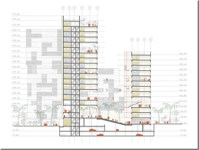
![]()
Award World Architecture Festival 2011— Project of the Year – Master Planning
![clip_image002[55] clip_image002[55]](http://lh4.ggpht.com/-kVAaRDvVMfA/TtfkJS4fFoI/AAAAAAAACi4/cKW1WZ1IGr4/clip_image00255_thumb2.jpg?imgmax=800)
West Kowloon Cultural District Conceptual Plan
Location Hong Kong
Architect Rocco Design Architects Ltd, Hong Kong
![clip_image002[57] clip_image002[57]](http://lh5.ggpht.com/-m5NnDV78OVQ/TtfkLhIzQRI/AAAAAAAACjI/UC88PXF9sWo/clip_image00257_thumb2.jpg?imgmax=800)
Photograph by Pak Chung
The proposed Conceptual Plan for the West Kowloon Cultural District (WKCD) aspires to evoke a social energy conducive to the spirit of exploration and discovery, hence the essence for long-term sustainable cultural development for Hong Kong. The programmatic disposition of the master plan is structured on a 3-layer organization: green terrain (south), city link (north) and a cultural zone (centre) for the arts. Overlaid onto its framework is an urban street-grid. The Conceptual Plane aim is to offer a low carbon sustainable community.
![clip_image002[59] clip_image002[59]](http://lh4.ggpht.com/-xdTlBk2_dt8/TtfkNSGfe0I/AAAAAAAACjU/BCny9sxjUNo/clip_image00259_thumb2.jpg?imgmax=800)
The proposed Conceptual Plan for the West Kowloon Cultural District (WKCD) aspires to evoke a social energy conducive to the spirit of exploration and discovery, hence the essence for long-term sustainable cultural development for Hong Kong. The programmatic disposition of the master plan is structured on a 3-layer organization:
1) The Green Terrain at the south is a continuous undulating green lawn by the waterfront filled with leisurely retail and diners;
2) The City Link at the north fuses with the existing neighbourhood and accommodates spaces for living, working and all the commercial activities;
3) The Cultural Core in the middle unifies all the visual and performing arts facilities to promote participation by the locals as well as the overseas.
![clip_image002[61] clip_image002[61]](http://lh6.ggpht.com/-wtchlXBXHxs/TtfkPM6OMVI/AAAAAAAACjo/qGCcWHT4sa8/clip_image00261_thumb1%25255B1%25255D.jpg?imgmax=800)
![clip_image002[63] clip_image002[63]](http://lh3.ggpht.com/-9SwChCEInHM/TtfkQxQ0ffI/AAAAAAAACj4/wHKmReBeP18/clip_image00263_thumb2%25255B1%25255D.jpg?imgmax=800)
This planning framework addresses the need for a cultural ecology to provide education, incubation, commercial supports and opportunities for production. The master plan concept focuses on promoting interactivities and synergies between different components of the new District. Overlaid onto the 3-layer framework is an urban street-grid extended from the adjacent neighbourhoods to confer a social and historic tie with the surrounding old neighbourhoods. A series of 3 dimensional public spaces each being strategically paired with a cultural venue evolve into a social network of diversity, inclusivity and interactivities to celebrate people’s cultural life prompted by the architectural settings. The Green Terrain on the south gently slopes down to fuse with the waterfront promenade on the south to reflect a 3-dimensional pedestrian traffic and circulation system. A Harbour Park is proposed at the western end which is a free-for-all outdoor open space with spectacular panoramic view of the Victoria Harbour. The Conceptual Plan aims to offer a low carbon sustainable community not just for artists but for the general inhabitants of the new district.
![clip_image002[65] clip_image002[65]](http://lh3.ggpht.com/-VGQY8kfgJwM/TtfkSokpGxI/AAAAAAAACkI/ik0PKXdooOc/clip_image00265_thumb1.jpg?imgmax=800)
![clip_image002[67] clip_image002[67]](http://lh3.ggpht.com/-rtpfFTGmRLg/TtfkUXy6VGI/AAAAAAAACkY/sPL2GHGRAXI/clip_image00267_thumb.jpg?imgmax=800)
![clip_image004[17] clip_image004[17]](http://lh6.ggpht.com/-f900E9GI1xo/TtfkVxy_d0I/AAAAAAAACkk/UxnuZ7tfZe4/clip_image00417_thumb.jpg?imgmax=800)
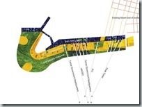
![clip_image006[5] clip_image006[5]](http://lh5.ggpht.com/-4BseUu0dQak/TtfkYhSzezI/AAAAAAAAClE/OBE5IFuh2m4/clip_image0065_thumb.jpg?imgmax=800)
![clip_image002[69] clip_image002[69]](http://lh5.ggpht.com/-Weyk-VRaHP0/Ttfkaf_Q9LI/AAAAAAAAClY/dAavMckoB30/clip_image00269_thumb.jpg?imgmax=800)
![clip_image004[19] clip_image004[19]](http://lh5.ggpht.com/-a6G2eqCMqq4/TtfkbqZ3ybI/AAAAAAAAClk/DR-3IVSU_K8/clip_image00419_thumb.jpg?imgmax=800)
![clip_image006[7] clip_image006[7]](http://lh4.ggpht.com/-rE0Yz4nt46s/TtfkdHrYU3I/AAAAAAAACl4/oX9VfEWlWDE/clip_image0067_thumb.jpg?imgmax=800)
![clip_image008[1] clip_image008[1]](http://lh3.ggpht.com/-P0e7RcUqfw4/TtfkepkNcJI/AAAAAAAACmI/LXQCc9uxKQQ/clip_image0081_thumb.jpg?imgmax=800)
![clip_image002[71] clip_image002[71]](http://lh3.ggpht.com/-aqiYFo9kADc/TtfkgYsKX9I/AAAAAAAACmY/ToN5b9nEbI8/clip_image00271_thumb.jpg?imgmax=800)
![clip_image004[21] clip_image004[21]](http://lh4.ggpht.com/-xlaTWocIvz4/Ttfkh4eJpFI/AAAAAAAACmo/0cs2P3j8V1I/clip_image00421_thumb.jpg?imgmax=800)
![clip_image006[9] clip_image006[9]](http://lh6.ggpht.com/-68d9ixTVQ9A/TtfkkaLdsJI/AAAAAAAACm4/8lzR5b8Frkc/clip_image0069_thumb.jpg?imgmax=800)
![clip_image008[3] clip_image008[3]](http://lh5.ggpht.com/-uxQNessZjU0/TtfklsXfqQI/AAAAAAAACnE/11ZErGNVB6s/clip_image0083_thumb.jpg?imgmax=800)
![clip_image002[73] clip_image002[73]](http://lh6.ggpht.com/-k4OAOmNUvHo/TtfkntlwjHI/AAAAAAAACnY/oBhPDmhSVro/clip_image00273_thumb1.jpg?imgmax=800)
![]()
Award World Architecture Festival 2011— Infrastructure Project of the Year
![clip_image002[75] clip_image002[75]](http://lh5.ggpht.com/-xOC2QB4UO6g/TtfkrIYxKdI/AAAAAAAACn4/yQRJmEJfcR8/clip_image00275_thumb1.jpg?imgmax=800)
Hanimaadhoo International Airport
Location Maldives
Architect Integrated Design Associates Limited
Hong Kong
Client / Developer
GMR Airport Developers Ltd
India
Renderer
Crystal Computer Graphics Ltd
Hong Kong
Structural Engineer
Buro Happold Ltd
United Kingdom
The new airport, designated as the country’s second international gateway, is located on an island with very limited land mass for an international airport of this size. With airfield infrastructure consuming nearly all the available land our concept of a “floating terminal” has been selected by the Government for its innovative, exciting and eco-friendly approach. The proposed terminal is built entirely on stilts over water without reclamation to preserve the existing environment and the natural coastline. With blue sea, white sandy beach as backdrop the new airport aims to provide passengers with a unique and memorable travel experience.
![clip_image002[77] clip_image002[77]](http://lh4.ggpht.com/-sXwUwSYUGg0/TtfkszLFZhI/AAAAAAAACoI/LkCkGF45LOw/clip_image00277_thumb1.jpg?imgmax=800)
![clip_image002[79] clip_image002[79]](http://lh3.ggpht.com/-_MKZG3_j8Z8/Ttfku2yEVHI/AAAAAAAACoY/xsBfyIu8W2g/clip_image00279_thumb2.jpg?imgmax=800)
The new airport, designated as the country’s second international gateway, is located on an island with very limited land mass for an international airport of this size. With airfield infrastructure consuming nearly all the available land our concept of a “floating terminal” has been selected by the Government for its innovative, exciting and eco-friendly approach. The proposed terminal is built entirely on stilts over water without reclamation to preserve the existing environment and the natural coastline. With blue sea, white sandy beach as backdrop the new airport aims to provide passengers with a unique and memorable travel experience. All passengers arrive and leave the airport by boats. As a single level facility the new terminal is both convenient and easy to use. The modular terminal structure is designed for flexibility to grow according to traffic demand. Its north facing shell-form roofs, made of timber lattice supported on laminated timber arches to evoke the architectural vernacular of the area, brings in abundance of natural light. Passengers move through the building via covered bridges spanning over water, beaches and wait in lounges nestled amongst palm trees. The building has 50% of its area outdoor on decking for passengers to witness the rich marine life at sea level. Together with the use of natural ventilation, effective solar shading and hydro-thermal cooling this strategy greatly reduces the need for full air-conditioning. The ecologically sensitive design ensures that this will be one of the most energy efficient and environmentally sustainable terminal buildings in the world.
![clip_image002[81] clip_image002[81]](http://lh6.ggpht.com/-FzeX1LraPac/TtfkwbRxY7I/AAAAAAAACoo/vOS5I21oASo/clip_image00281_thumb1.jpg?imgmax=800)
![clip_image002[83] clip_image002[83]](http://lh4.ggpht.com/-wIIz-imiB1o/TtfkyZQvtKI/AAAAAAAACo4/6HeN9sRue6s/clip_image00283_thumb1.jpg?imgmax=800)
![clip_image004[23] clip_image004[23]](http://lh6.ggpht.com/-RvEVUgBxwoQ/TtfkzxEfqdI/AAAAAAAACpE/9q00HiQiD8I/clip_image00423_thumb2.jpg?imgmax=800)
![clip_image006[11] clip_image006[11]](http://lh6.ggpht.com/-HGE90RsjtjM/Ttfk1VtZ63I/AAAAAAAACpU/fnP8CwxAKGk/clip_image00611_thumb1.jpg?imgmax=800)
![clip_image002[85] clip_image002[85]](http://lh5.ggpht.com/-YKFRQ_lCIBI/Ttfk2oV_FBI/AAAAAAAACpo/hlpRL7dk1e0/clip_image00285_thumb1.jpg?imgmax=800)
![clip_image004[25] clip_image004[25]](http://lh6.ggpht.com/-Z8DsU7VYunU/Ttfk4TIZpmI/AAAAAAAACp4/w-3qFsR9o6c/clip_image00425_thumb1.jpg?imgmax=800)
![]()
Award World Architecture Festival 2011—Future Project of the Year–Health
![clip_image002[1] clip_image002[1]](http://lh4.ggpht.com/-gtx44-3VC08/Ttfk7_2ROMI/AAAAAAAACqY/a3bcUUmtrnM/clip_image002%25255B1%25255D_thumb%25255B1%25255D.jpg?imgmax=800)
Binh Chanh Pediatric Hospital
Location Ho Chi Minh City, Vietnam
Architects VK, Roeselare, Belgium
2050 A+P, Vietnam
Nhat My, Vietnam
Acoustics Consultant
VK
Belgium
Architect
2050 A+P
Vietnam
Architect
Nhat My
Vietnam
Architect
VK
Belgium
Client / Developer
Ministry of Health
Vietnam
Environmental Engineer
VK
Belgium
Interior Designer
VK
Belgium
Structural Engineer
VK
Belgium
The Centre presents a welcoming and open environment, offering a natural habitat for care whilst still allowing plenty of opportunity for other activities. The double-height ground floor at entrance level facilitates the rehabilitation process with a sports and fitness facility including a swimming pool, and also a restaurant and theatre. As well as patients, family members and members of the local community (schools, theatre groups etc) are invited to use these facilities on a regular basis. The meandering facade of the building allows the forest inside the building.
![clip_image002[3] clip_image002[3]](http://lh5.ggpht.com/-gmQKqQmiV1M/Ttfk9_H-ySI/AAAAAAAACqk/GaBl9TWDOjw/clip_image002%25255B3%25255D_thumb%25255B1%25255D.jpg?imgmax=800)
We aim for a project with strong identity, where children feel at home as a patient and a child. We aspire to create a recognizable and open design, that has the potential of organizing the complex program in a clear structure. The design offers an abundance of air and light and an optimal relation between inside and outside. The healing environment offers to the children, as well as to their family and staff clearness and quietness, providing an essential support to the nursing program.
![clip_image002[5] clip_image002[5]](http://lh4.ggpht.com/-APWDmi6cCKM/Ttfk_QSLAII/AAAAAAAACq4/Obj4RGvGhQA/clip_image002%25255B5%25255D_thumb%25255B1%25255D.jpg?imgmax=800)
PUBLIC HOSPITAL
The location of the hospital is almost central in a new development area and therefore the hospital design will, together with its size, impact the masterplan development. In our area plan, a central, public square in front of the hospital accentuates the public function of the building.
The main entrance of the hospital is orientated to the east side. This is the most convenient solution to avoid the free-way noise and smell pollution on the west, where waste collection and treatment is organized.
Most traffic roads run in the north–south direction. To enforce an east–west movement for pedestrians, we create rectangular landscape features along informal footpaths to obtain maximum connectivity and communication between different healthcare facilities. We aim for a masterplan with good image quality, with unique features that give each place its specific identity.
![clip_image002[7] clip_image002[7]](http://lh4.ggpht.com/-TksBMKh0FyM/TtflA6KRmXI/AAAAAAAACrI/hMPW0JvZCWg/clip_image002%25255B7%25255D_thumb%25255B1%25255D.jpg?imgmax=800)
![clip_image002[9] clip_image002[9]](http://lh4.ggpht.com/-OprN4pfT5n0/TtflDADgIlI/AAAAAAAACrY/SIPjfwUH1kU/clip_image002%25255B9%25255D_thumb%25255B1%25255D.jpg?imgmax=800)
SCULPTURAL LANDSCAPE
It’s a delicate matter to reconcile a landscape and an extensive and complex hospital program. In our design, the landscape prevails as the always returning background for every perspective and every view. The artificial landscape is characterized by an organic shaped slope in the east–west direction, a buffer between the free-way and the rest of the masterplan. It also creates additional external areas on the hospital site.
Small-scaled flower-shaped buildings cover the sculptural landscape, partly defining the project’s image. These organic shapes house the inpatient wards, totalling 1.000 beds. The landscape passes underneath the elliptical buildings, and forms gardens and patios with green and water features. The wards are lifted to the level with the most beautiful view.
![clip_image002[11] clip_image002[11]](http://lh5.ggpht.com/-aIHj5-mIF8o/TtflE4hCUhI/AAAAAAAACro/zxAbsvoLYTg/clip_image002%25255B11%25255D_thumb%25255B1%25255D.jpg?imgmax=800)
![clip_image002[13] clip_image002[13]](http://lh3.ggpht.com/-00tMhuIzCg4/TtflGjzRY7I/AAAAAAAACr4/swHjjzb30XA/clip_image002%25255B13%25255D_thumb%25255B3%25255D.jpg?imgmax=800)
![clip_image002[15] clip_image002[15]](http://lh5.ggpht.com/-LOXHbkmyR-A/TtflIMlBCbI/AAAAAAAACsI/6CG9BxN797A/clip_image002%25255B15%25255D_thumb%25255B2%25255D.jpg?imgmax=800)
VOLUMES
Protected from the direct sunlight and ‘hidden’ in the artificial landscape are all outpatient and paramedical services, around a central public square, with a capacity for up to 6.000 patients per day. On the first floor are all the operating theatres and Intensive care units. A protective roof will combine these specific functions and provides shading and covered outdoor spaces. Sunken gardens and patios provide natural light and offer a certain sense of privacy and safety at the same time. In between the medical floors and the wards, an open level is dedicated for staff and education. The openness of this semi-public level creates exciting views over the sculptural landscape through the building.
Special care is given to circulation routes, in the conviction that daylight and exterior views offer the best guarantees for a clear and simple way-finding. Roof openings provide daylight and air, and increase the orientation of the children, relatives and staff.
Three vertical circulation shafts form a focal point on the central place. Inside the departments the routes run along patios and atria. The successive spaces, with different atmospheres, form quiet spaces in the public circulation.
The wards as separate entities stimulate the readability of the building. The patient rooms are organized around an internal void, creating an oval ground plan with a fantastic view for all the rooms. Daylight penetrates into the building, through the day rooms and family rooms. A back bone connects all elements like a spine.
![clip_image002[17] clip_image002[17]](http://lh3.ggpht.com/-ieYkF7TBeaI/TtflJfgS3xI/AAAAAAAACsU/hiQLUmdSFr8/clip_image002%25255B17%25255D_thumb%25255B1%25255D.jpg?imgmax=800)
![clip_image002[19] clip_image002[19]](http://lh3.ggpht.com/-_EU_FmnhJOE/TtflLOMLymI/AAAAAAAACso/RYqL8yP_nXs/clip_image002%25255B19%25255D_thumb%25255B1%25255D.jpg?imgmax=800)
![clip_image002[21] clip_image002[21]](http://lh4.ggpht.com/-bz9_EWOQarY/TtflMB0MS5I/AAAAAAAACs0/pebNqQEq1K4/clip_image002%25255B21%25255D_thumb%25255B1%25255D.jpg?imgmax=800)
PASSIVE MEASURES
Natural cross ventilation uses the wind pressure and stack effect to ventilate the wards. As such, the natural ventilation is more stable on days with less or no wind. It is however advisable to use mechanical ventilation in all medical rooms and also where contamination is to be avoided.
Solar shading. All medical department are located under a curved overhang that forms an organic landscape, consisting of structural screening. In this way the solar gains in the patient rooms will be limited, needing less energy to cool the rooms. As a bonus, this type of solar shading does not obstruct the visibility to the outside.
Using the thermal mass of concrete walls and floor slabs, night cooling also reduces the energy consumption for cooling. Walls and slabs absorb the heat built up during the daytime, through a combination of solar gain, electronic equipment and user occupancy. As the external temperature drops at night, the building can be cooled by partially opening the vents around the building.
Solar energy. Solar panels absorb the sun’s heat and store this energy in a reservoir. The solar collectors have an optimal orientation and slope angle. On sunny days, the solar panels produce 75% of the demand for sanitary hot water. This way, 40% of the heating requirement for hot water is provided by the sun, in a carbon neutral way. In many cities around the world it has been recognized that the most significant ecological advantage of roof planting is storm water management. Roughly 50-60% of rainfall is expected to be retained by an extensive green roof. Any excess water can be collected and stored in a modern rain management system or cistern. As another benefit, the vegetation and substrate layer acting as a water filter; these layers hold back particles, dust, solute pollutants, and even heavy metals. The excess rainwater can then be used to irrigate the roof, used as toilet water, or any other available purposes. The roof can in normal conditions suffer from huge thermal fluctuations on its upper surface throughout the day and through the year. In extreme cases these can range over 100 °C. Planting the roof surface dramatically reduces the amount of solar radiation absorbed by the roof’s bare surface. The high daily thermal swings are neutralized and the annual fluctuations are decreased to between 20 and 25°C.
![clip_image002[23] clip_image002[23]](http://lh4.ggpht.com/-dtdROCYJAXI/TtflN2fxGLI/AAAAAAAACtI/QsxyOyDvhRk/clip_image002%25255B23%25255D_thumb%25255B1%25255D.jpg?imgmax=800)
![clip_image004[1] clip_image004[1]](http://lh5.ggpht.com/-lsaIMMtsjGA/TtflPbfoJRI/AAAAAAAACtU/o6swQ8PRu2U/clip_image004%25255B1%25255D_thumb%25255B1%25255D.jpg?imgmax=800)
![clip_image006[1] clip_image006[1]](http://lh6.ggpht.com/-MWPRPiM-Tiw/TtflRJ027WI/AAAAAAAACtk/88kwAZrImGk/clip_image006%25255B1%25255D_thumb%25255B1%25255D.jpg?imgmax=800)
![]()
Award World Architecture Festival 2011— Landscape Project of the Year
![clip_image002[25] clip_image002[25]](http://lh4.ggpht.com/-vd2HxLMKQxM/TtflUvCmQhI/AAAAAAAACuI/kfvdlrhM0J0/clip_image002%25255B25%25255D_thumb%25255B1%25255D.jpg?imgmax=800)
Shoreline Walk
Location Beirut, Lebanon
Architect Gustafson Porter
Civil Engineer
BECT
Lebanon
Client / Developer
Solidere / Urban Development
Lebanon
Environmental Engineer
Not applicable
United Kingdom
Landscape Architect
Gustafson Porter
United Kingdom
Lighting Consultant
PSLAB
Lebanon
Local Architect
Imad Gemayel Architects
Lebanon
Project Manager
Solidere / Urban Development
Lebanon
Structural Engineer
BECT
Lebanon
Water Features
Fountain Workshop
United Kingdom
The ‘Shoreline Walk’ is a sequence of connected spaces which form part of the reconstruction of the Beirut city centre. The project demonstrates Beirut’s character and resolve. It guides and reveals Beirut’s history and forms a connective spine to the city. A continuous white limestone line marks the ground and a wide pedestrian promenade. It features four areas to pause and reflect on pre-war city and forgotten memories.
![clip_image002[27] clip_image002[27]](http://lh6.ggpht.com/-02_wCxrw3_s/TtflV5qHpTI/AAAAAAAACuY/nXln4XQak6k/clip_image002%25255B27%25255D_thumb%25255B3%25255D.jpg?imgmax=800)
![clip_image002[29] clip_image002[29]](http://lh5.ggpht.com/-POIz5hXzhgM/TtflXYZAH8I/AAAAAAAACuo/iFeRcCWSo1U/clip_image002%25255B29%25255D_thumb%25255B4%25255D.jpg?imgmax=800)
![clip_image002[31] clip_image002[31]](http://lh5.ggpht.com/-485bPygxs10/TtflZHwVwXI/AAAAAAAACu4/ALcnJJYzVhk/clip_image002%25255B31%25255D_thumb%25255B1%25255D.jpg?imgmax=800)
![clip_image004[3] clip_image004[3]](http://lh5.ggpht.com/-rvsIWZ9hUtY/TtflatqnbRI/AAAAAAAACvI/qJXGn6mtgro/clip_image004%25255B3%25255D_thumb%25255B1%25255D.jpg?imgmax=800)
The ‘Shoreline Walk’ is a sequence of connected spaces which form part of the reconstruction of the Beirut city centre. The area suffered physically and emotionally during the 1975-1991 Civil War. Beirut was once a melting pot of cultures and religions but the war created the ‘Green Line’, a physical barrier between the Christian East and Muslim West. This might have been difficult to erase, however the rebuilding demonstrates the Beirut’s character and resolve.
The city was once known for its rocky shoreline Cornice, with its avenues of palms and cafés but during the war a rubbish mountain grew from daily waste tipped into the Mediterranean Sea. Areas have been both preserved and demolished by the new master plan, whilst the remediated landfill is set to become a new district, projecting out into the sea. Rather than leave the old coastline land-locked and redundant, it was decided to create a pedestrian route that straddled the old and new city boundaries. The ‘Shoreline Walk’ is placed between the natural topography and rationalised medieval street layout of the old city, and the engineered grid of the new land-filled area. It is located between memories and aspirations, between activities that made a connection to an organic coastline and a new contemporary landscape.
Research revealed the evolution of Beirut’s coastline. The first Phoenician settlers arrived in 1220BC, followed by; Romans in 64BC, Mamluks in 1291AD, Ottomans in 1516 and the French in 1918. Successive civilisations adjusted the coastline to create harbours that brought wealth to the city.
Within this context, we have suggested a new line which guides and reveals elements of history and forms a connective spine. A continuous white limestone line marks the ground and a wide pedestrian promenade. Organic movement line runs along the length of the walk, links the four open spaces and re-establishes an East-West link between places that might not be connected by the new grid. Physical and visual links extend beyond the spaces to re-establish memories between key monuments and spaces.
![clip_image002[33] clip_image002[33]](http://lh6.ggpht.com/-xsiM2fna274/TtflcdZZjQI/AAAAAAAACvY/v6mPfrAkK1w/clip_image002%25255B33%25255D_thumb%25255B1%25255D.jpg?imgmax=800)
![clip_image004[5] clip_image004[5]](http://lh3.ggpht.com/-CLY6Jc0Iyb4/TtfleLKz5WI/AAAAAAAACvo/zzQ7oe2wl4M/clip_image004%25255B5%25255D_thumb%25255B1%25255D.jpg?imgmax=800)
The promenade is also inspired by the historic ‘Corniche’, a wide palm-lined walk which followed the coastline from the edge of the city centre to the public beach, 2km to the west. In a city with few parks and squares, this is the most popular open space with a constant flow of walkers, joggers, cyclists, bread sellers and wedding parties, watched by people in the cafés. The current ‘Corniche’ stops at the edge of the city centre but the Shoreline Walk will reconnect it.
It will be recognised by the paved and planted landscape, lighting and water features which combine to enhance its perception within an otherwise uniform urban context. To the south of the promenade, light coloured paving and trees signify ‘dry land’, as it existed before the war. To the north, open areas of dark granite, boardwalks and timber pergolas mark the sea’s previous position. The granite’s reflective quality is enhanced by water features or rainfall, creating the illusion that the sea has returned.
Research into the spaces of the walk revealed the character of the pre-war city and forgotten memories, which inspired four areas to pause and reflect. Each ‘memory’ generates an atmosphere with facilities and functions alongside required by a contemporary city.
All Saints Square will connect with the new Corniche and Marina. Before the war, the church occupied a headland surrounded by the Mediterranean Sea. Historic photos revealed a calm space and a promontory for diving into the sea. These qualities are re-interpreted in the new square, creating an intimate, self contained space, lowered to the original ground level adjacent to the church. Views focus towards the sky, the space is enclosed by soft green textured walls and sheltered from traffic, creating a haven of textures infused with the summer aroma of Jasminum officinale. At street level, a raised route provides direct passage through the space, connecting the walk with the Corniche whilst allowing views into the garden below.
![clip_image002[35] clip_image002[35]](http://lh3.ggpht.com/-p9oEF7PKmQU/TtflgNqPqmI/AAAAAAAACv4/9KHpx8DPSxs/clip_image002%25255B35%25255D_thumb%25255B1%25255D.jpg?imgmax=800)
![clip_image004[7] clip_image004[7]](http://lh5.ggpht.com/-Z20Kxf3NFcU/Ttflh9Si3mI/AAAAAAAACwI/TqEcftc8lC0/clip_image004%25255B7%25255D_thumb%25255B2%25255D.jpg?imgmax=800)
![clip_image006[3] clip_image006[3]](http://lh5.ggpht.com/-LH6tgqP9Gvo/TtfljTrgbjI/AAAAAAAACwU/_3KoYftunOs/clip_image006%25255B3%25255D_thumb%25255B1%25255D.jpg?imgmax=800)
![clip_image008[1] clip_image008[1]](http://lh6.ggpht.com/-5XXAnb_6mjA/Ttflk9QPfhI/AAAAAAAACwo/0gUdhYDBqf4/clip_image008%25255B1%25255D_thumb%25255B2%25255D.jpg?imgmax=800)
Shoreline Gardens is the site of the historic ‘Avenue des Français’, Beirut’s first coastal promenade or ‘Corniche’. During the war years, it became deserted and buried under landfill. Our design revives the ‘Avenue des Français’, to provide a contemporary promenade. A long linear water feature and pergola unite the space, creating water movement over an undulating surface and dappled shade to sit below and relax ? and re-establish this area as a meeting point.
Zeytoune Square is situated to the south of the Shoreline Walk, and provides a key link to the city. The square will become a celebration of modern Beirut and a place for cultural events by utilising the informal terraces. The surface extends across the roads to the surrounding buildings, unifying the site to one large space. The bold paving is inspired by the black and white patterning from traditional Lebanese architecture and specially designed benches with WiFi are placed under the shade of Albizia trees.
![clip_image002[37] clip_image002[37]](http://lh4.ggpht.com/-cKqDmblFZLw/TtflmYNj1gI/AAAAAAAACw4/bozzeF-mODY/clip_image002%25255B37%25255D_thumb%25255B1%25255D.jpg?imgmax=800)
![clip_image004[9] clip_image004[9]](http://lh6.ggpht.com/-8V2RumtKTaU/Ttfln8pb8rI/AAAAAAAACxI/t_9SMp3go7E/clip_image004%25255B9%25255D_thumb%25255B1%25255D.jpg?imgmax=800)
![clip_image006[5] clip_image006[5]](http://lh4.ggpht.com/-y1CNUtyacTU/TtflpQPnpYI/AAAAAAAACxY/ENS7jquQbBA/clip_image006%25255B5%25255D_thumb%25255B1%25255D.jpg?imgmax=800)
![clip_image008[3] clip_image008[3]](http://lh5.ggpht.com/-54F90TA4hiU/TtflrZVsfiI/AAAAAAAACxo/80QHxR0rr7w/clip_image008%25255B3%25255D_thumb%25255B1%25255D.jpg?imgmax=800)
![clip_image002[39] clip_image002[39]](http://lh4.ggpht.com/-ygqluDhhp8o/TtfltI-EV3I/AAAAAAAACx4/SccSnD6PYxA/clip_image002%25255B39%25255D_thumb%25255B1%25255D.jpg?imgmax=800)
![clip_image004[11] clip_image004[11]](http://lh4.ggpht.com/-iiy9aOGbSTM/Ttfluime58I/AAAAAAAACyI/BWPH0t0Bnek/clip_image004%25255B11%25255D_thumb%25255B1%25255D.jpg?imgmax=800)
![clip_image006[7] clip_image006[7]](http://lh4.ggpht.com/-WCQavAJIYiU/TtflwW1frAI/AAAAAAAACyY/uuAu4GmIVUI/clip_image006%25255B7%25255D_thumb%25255B1%25255D.jpg?imgmax=800)
![]()
Award World Architecture Festival 2011—Category Structural Project
![clip_image002[41] clip_image002[41]](http://lh5.ggpht.com/-AAmovtxsAJc/TtflzmNrE4I/AAAAAAAACy4/udCVSQ43YFc/clip_image002%25255B41%25255D_thumb%25255B7%25255D.jpg?imgmax=800)
Beekman Tower
Location 8 Spruce Street-Beekman Tower, New York, USA
Architect
Gehry Partners, LLP
United States of America
Client / Developer
Forest City Ratner
United States of America
Environmental Engineer
Mueser Rutledge Consulting Engineers
United States of America
Main Contractor
Kreisler Borg Florman
United States of America
Structural Engineer
WSP Cantor Seinuk
United States of America
The 867 ft, 76-story Beekman Tower, designed by renowned architect Frank Gehry, is New York City’s tallest residential tower. Located in the middle of the block bounded by Nassau, Beekman, Spruce and Gold Streets, just south of the Brooklyn Bridge, the 1.1 million SF mixed-use building has redefined the skyline of Downtown Manhattan. It is a reinforced concrete building and the structure is composed of cast-in-place, concrete flat plate floors supported by reinforced concrete columns and shear walls. The 5 to 6 ft deep mat foundation is supported on 18” diameter concrete encased steel piles and also various capacity drilled caissons adjacent to an MTA subway tunnel.
![clip_image002[45] clip_image002[45]](http://lh5.ggpht.com/-Z48IZCusCoE/Ttfl2JjZH6I/AAAAAAAACzI/NRjjm2o9abo/clip_image002%25255B45%25255D_thumb%25255B2%25255D.jpg?imgmax=800)
The 867 ft, 76-story iconic Beekman Tower, designed by renowned architect Frank Gehry, is New York City’s tallest residential tower. Located in the middle of the block bounded by Nassau, Beekman, Spruce and Gold Streets, just south of the Brooklyn Bridge, the 1.1 million SF mixed-use building has redefined the skyline of Downtown Manhattan. The tower offers 903 high-end residential units, luxury amenities and unobstructed 360 degree panoramic views and sits above a 100 foot tall, 6-story podium that comprises a new 100,000 SF public school as well as a 21,000 SF ambulatory care center for New York Downtown Hospital.
The building’s main aesthetic is its undulating, asymmetrical steel curtain wall with curvaceous folds and crinkles reminiscent of the folds in a piece of gently draped fabric. The sculptural façade is comprised of stainless steel and glass panels and gives the building a sense of movement; however Mr. Gehry’s “Bernini folds” conceals a multitude of challenges successfully met through the implementation of innovative structural engineering solutions.
![clip_image002[47] clip_image002[47]](http://lh4.ggpht.com/-x8fFqNzE6Vk/Ttfl4WErnTI/AAAAAAAACzY/gOxrC4LgPok/clip_image002%25255B47%25255D_thumb%25255B2%25255D.jpg?imgmax=800)
Beekman Tower is a reinforced concrete building. The structure is composed of cast-in-place, concrete flat plate floors supported by reinforced concrete columns and shear walls. The 5 to 6 ft deep mat foundation is supported on 18” diameter concrete encased steel piles and also various capacity drilled caissons adjacent to an MTA subway tunnel.
The lateral wind and seismic resisting system is composed of reinforced concrete shear walls surrounding the building’s core. For increased system efficiency, outrigger walls are introduced at mechanical floor levels 6, 38 and 76. The outrigger walls engage the perimeter columns augmenting the lateral system substantially. These concrete walls were carefully located to minimize the impact of the mechanical equipment functions. The fact that all the shear walls are centralized around the core with no walls dissecting the typical residential floors, provided the architect/developer great design opportunities unobstructed by the structural elements. The outriggers and their associated belt wall system have a huge effect in reducing the building drift as well as the base moments due to lateral forces. This helped reduce the thickness of the shear walls and ensured an extremely efficient system. In addition, in order to further provide adequate lateral stiffness and minimize architectural impact, high strength concrete of over 12,000 psi was specified for the shear walls and columns whereas the specification for slab concrete ranged from 5,000 to 8,600 psi.
![clip_image002[49] clip_image002[49]](http://lh6.ggpht.com/-bgxMDA2dM2k/Ttfl6E_eCKI/AAAAAAAACzo/O2eWJUpaOZw/clip_image002%25255B49%25255D_thumb%25255B2%25255D.jpg?imgmax=800)
The outrigger walls were also used as transfer structures for the exterior columns. The building stacking changes at the outrigger floors and most of the exterior column pickups are undertaken by the outriggers to maintain efficiency of internal space.
A further unique challenge of axial shortening had to be met. Studies were performed and over pour values were specified for casting the columns in order to mitigate the effect of differential axial shortening between the core walls and the columns not just for the final construction condition but also for the construction sequencing stages.
![clip_image002[51] clip_image002[51]](http://lh5.ggpht.com/-3kdoNBubby8/Ttfl8eUoXGI/AAAAAAAACz4/D1OflQLx4Mk/clip_image002%25255B51%25255D_thumb%25255B1%25255D.jpg?imgmax=800)
The structural challenge of accommodating the undulating façade, as well as the differing apartment layouts has been met by ‘walking’ the columns at several locations and levels. No tower floor plates are alike and slab edges are in different planes on every floor, however in order to simplify the formwork, columns were designed and constructed to stay in the same plane for about every eight to twelve floors. At the ‘change’ levels, the columns broaden or ‘walk’ to encompass the column location above and below. This strategy, apart from avoiding the use of transfer beams, also avoided sloping the columns which would have required more complicated and laborious formwork while also maintaining the construction rhythm. In addition, 3-dimensional CAD detailing was undertaken to design the formwork for the undulating slab edges and maintain the sculptured edge detail of the concrete floors.
![clip_image002[53] clip_image002[53]](http://lh5.ggpht.com/-Ys7tmZbkNZk/Ttfl-mKfKEI/AAAAAAAAC0I/gHm4-CQRgsg/clip_image002%25255B53%25255D_thumb%25255B1%25255D.jpg?imgmax=800)
![clip_image002[55] clip_image002[55]](http://lh4.ggpht.com/-xSpJNSeUJ_k/TtfmBP9M2II/AAAAAAAAC0Y/CQo2BmVCGBs/clip_image002%25255B55%25255D_thumb%25255B1%25255D.jpg?imgmax=800)
Furthermore, all forms were hand-set because the layout changed so much and because slab edges are segmented and protrude. Indeed, exact placement of the 14,000 curtain wall embeds on the segmented slab edges was critical to correctly anchor the façade units and keep the construction on schedule.
The rectilinear podium is clad in terracotta-colored masonry and design was coordinated closely with the school architects (Swanke Hayden Connell) to ensure an optimum layout, bearing in mind that it is basically supporting 72 stories above. Larger clear spans of up to 35 feet with 10” to 12” flat plate floors were utilized to accommodate the school and hospital architectural layouts as opposed to the shorter spans using 8” flat plate floors within the residential spaces above.
Beekman Tower’s dramatic interior lobby is adorned with colossal oval-shaped concrete columns. These unique elliptical members were created by using custom-designed, 19 foot tall, fiber-reinforced polymer (FRP) column forms to create their imposing presence and beautiful aesthetic finish.
![clip_image002[57] clip_image002[57]](http://lh6.ggpht.com/-TFQtlyjY7xY/TtfmDUB50qI/AAAAAAAAC0o/hZQB48Gs4hg/clip_image002%25255B57%25255D_thumb%25255B2%25255D.jpg?imgmax=800)
The site is tightly bound on all sides by a hospital, a university, two landmark historic buildings and a subway tunnel. Construction logistics met these challenges by continuously having two concrete trucks available in the building’s west plaza (which was designed to carry their loads) for continuous pouring. The construction team managed to keep to a 2-day cycle at the highest floors by pumping concrete all the way to the top of the building. Furthermore, full coordination and communication was maintained with the appropriate authorities to successfully meet the challenges of the major upgrading being undertaken to surrounding streets as well as the proximity of the subway tunnel.
![clip_image002[59] clip_image002[59]](http://lh4.ggpht.com/-4AzeJM6fHRU/TtfmFDfs6cI/AAAAAAAAC04/lJwfKFpEE_Q/clip_image002%25255B59%25255D_thumb%25255B2%25255D.jpg?imgmax=800)
Foundation work started in October 2006 and work on the superstructure began in April 2008. The building topped out in November 2009 and the project was completed under budget and on schedule in spite of a 3 month work hiatus related to the recent recession. The Public School is due to open in September 2011 and residential leasing and occupancy began in February 2011. The fast construction of this unique and iconic building is testament to the overall team’s efficient design and construction planning.
![]()
World Building of the Year Award 2011 Office (inc mixed use)
![clip_image002[61] clip_image002[61]](http://lh3.ggpht.com/-t7qXethvQ2Q/TtfmIa6aCaI/AAAAAAAAC1Y/aqiLRMbypaw/clip_image002%25255B61%25255D_thumb%25255B1%25255D.jpg?imgmax=800)
Media-ICT/ 22@
Barcelona, Spain,
Architecte Cloud 9
Enric Ruiz-Geli
Spain
Photograph by Luis Ros
Client / Developer
El Consorci de la Zona Franca
Spain
Environmental Engineer
Cloud 9
Spain
Instalation Engineers
Mr David Tusset
PGI grup
Spain
Structural Engineer
Mr Agustí Obiol
BOMA
Spain
The project was commissioned by The Consortium of the Zona Franca CZFB and @22Barcelona, an experimental district in the city. The architects were extremely interested in the digital city model based on information, communication and technology, with the idea of a city where what matters is knowledge, added value and patents.
![clip_image002[63] clip_image002[63]](http://lh5.ggpht.com/-k-Kr9r-CNNc/TtfmKUesHdI/AAAAAAAAC1o/yIr5RuFvyLI/clip_image002%25255B63%25255D_thumb%25255B2%25255D.jpg?imgmax=800)
The Industrial Revolution and now the Digital Revolution.
Today, in the information age, architecture is a technology platform that consists of computer system connections and new materials.
This project has been commissioned by The Consortium of the Zona Franca CZFB and 22 @ of Barcelona.
22@ is an experimental district with a powerful, distributed and accessible, energy load. Part of the Districlima network, where new business values are intangible. We were extremely interested in this digital city model based on ICT (information and communication technology), with the idea of a city where what matters is knowledge, added value and patents, in short, where the objective is for your architecture to be in sync with your own values.
![clip_image002[65] clip_image002[65]](http://lh6.ggpht.com/-cUMgrEkZB5U/TtfmM677B4I/AAAAAAAAC14/5AN__ltE_rQ/clip_image002%25255B65%25255D_thumb%25255B1%25255D.jpg?imgmax=800)
![clip_image002[67] clip_image002[67]](http://lh6.ggpht.com/-jZUTAmU8J24/TtfmOF8uGsI/AAAAAAAAC2E/4wOqtxZFdrU/clip_image002%25255B67%25255D_thumb%25255B2%25255D.jpg?imgmax=800)
![clip_image002[69] clip_image002[69]](http://lh3.ggpht.com/-5gh94A0CG_g/TtfmPubNrtI/AAAAAAAAC2Y/XzNCzDlpYYk/clip_image002%25255B69%25255D_thumb%25255B1%25255D.jpg?imgmax=800)
![clip_image004[13] clip_image004[13]](http://lh6.ggpht.com/-yvxTxT1JT1A/TtfmQ0d38_I/AAAAAAAAC2o/khVy2PJnVhY/clip_image004%25255B13%25255D_thumb%25255B1%25255D.jpg?imgmax=800)
![clip_image006[9] clip_image006[9]](http://lh6.ggpht.com/-u_tNlo32kyw/TtfmSpKsGdI/AAAAAAAAC24/I5Vg2nQK0q8/clip_image006%25255B9%25255D_thumb%25255B1%25255D.jpg?imgmax=800)
![clip_image008[5] clip_image008[5]](http://lh6.ggpht.com/-gdTAjZcxU6Q/TtfmUfwpEWI/AAAAAAAAC3E/EivhDVQdG9k/clip_image008%25255B5%25255D_thumb%25255B2%25255D.jpg?imgmax=800)
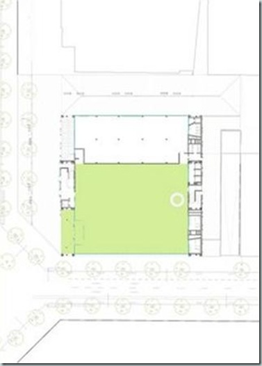
![clip_image002[71] clip_image002[71]](http://lh5.ggpht.com/-kY3htqMYG9k/TtfmYHVlKWI/AAAAAAAAC3s/eNt6SWNOnag/clip_image002%25255B71%25255D_thumb%25255B1%25255D.jpg?imgmax=800)
![clip_image002[73] clip_image002[73]](http://lh4.ggpht.com/-D6lYcqJCHpk/TtfmZmoqV6I/AAAAAAAAC38/nZ_LqDE1xws/clip_image002%25255B73%25255D_thumb%25255B1%25255D.jpg?imgmax=800)
![clip_image001[1] clip_image001[1]](http://lh3.ggpht.com/-ROc0KzUcsnU/TtfmbaI6asI/AAAAAAAAC4M/qPejp1BPLmc/clip_image001%25255B1%25255D_thumb%25255B2%25255D.jpg?imgmax=800)
The building volume forms a cube of 44m x 44m x 37.82m high; the site is 3,572.45 m2 in which the basement occupies the entire area, while above ground the occupation is 54.20%.
In total, the Media-ICT has 16,000 m2 above ground and two floors below ground (7100 m2) with capacity for 200 parking spaces.
The building is divided so that the upper floors (from eighth to fourth) are rented for big companies, the second and third floor have small spaces for emergent companies and the first floor with the Cibernariun and an auditorium offers a course program oppen to all the city residents.
The ground floor does not have pillars; public space invades the building with 36m x 40m of free space. The lobby of the building can host exhibitions, workshops, events…
![clip_image002[75] clip_image002[75]](http://lh5.ggpht.com/-H7-B6X5CtwM/TtfmdY8oTlI/AAAAAAAAC4c/Ia4lEM6lJ5Y/clip_image002%25255B75%25255D_thumb%25255B2%25255D.jpg?imgmax=800)
Construction is built from the top and moves downwards, becoming transparent, anti-gravitational, and almost liquid at the bottom. Thus, its impact on the street is minimal, about 8% mass with respect to the 1500 m2 floor surface area.
Unlike most of the buildings, which consume huge amounts of energy, the Media-ICT is designed to be a great generator and optimizes energy use.
SIMULATION ENERGY: Thanks to the energy simulation of the building the demands of heat and cold are adjusted accordingly minimizing the dimensioning of installations.
ENCLOSED BUILDING: The façade, made of inflatable ETFE cushions oriented south, act as a variable sunscreen, opening in winter to gain solar energy, and closing in summer to protect and shade. In the south west façade, Nitrogen based fog is introduced in the cushions, that by increasing its particles greater opacity is produced, thereby protecting users.
MONITORING: Both the façades and offices have been equipped with multiple temperature sensors, humidity or pressure that collect exterior information to adjust the interior conditions.
![clip_image002[77] clip_image002[77]](http://lh3.ggpht.com/-9K2ZBUDdkqY/TtfmfNPDJtI/AAAAAAAAC4s/hXL2PfNEnZQ/clip_image002%25255B77%25255D_thumb%25255B1%25255D.jpg?imgmax=800)
Media-ICT targets and achieves:
1-20% CO2 reduction due to the use of District Cooling, clean energy.
2-10% CO2 reduction due to the photovoltaic roof.
3-55% CO2 reduction due to the dynamic ETFE sun filters.
4-10% CO2 reduction due to energy efficiency related to smart sensors.
Total 95% CO2 reduction, the Media-ICT is a NET building almost a net zero building.
![clip_image002[79] clip_image002[79]](http://lh4.ggpht.com/-TckmsGMKhgY/Ttfmgr2uVOI/AAAAAAAAC48/0ORkGBAbbjA/clip_image002%25255B79%25255D_thumb%25255B2%25255D.jpg?imgmax=800)
![clip_image002[81] clip_image002[81]](http://lh3.ggpht.com/-JSvwMPMYPXU/TtfmiBkfAaI/AAAAAAAAC5M/m8Efkd9Llb8/clip_image002%25255B81%25255D_thumb%25255B1%25255D.jpg?imgmax=800)
![clip_image004[15] clip_image004[15]](http://lh3.ggpht.com/-i7hOMUIY_n0/TtfmkMH3TgI/AAAAAAAAC5c/l6cKMSSZtMI/clip_image004%25255B15%25255D_thumb%25255B1%25255D.jpg?imgmax=800)
![clip_image006[11] clip_image006[11]](http://lh4.ggpht.com/-BUW_jgC5YZ8/TtfmmP3cjkI/AAAAAAAAC5s/EbArJwgbJNg/clip_image006%25255B11%25255D_thumb%25255B1%25255D.jpg?imgmax=800)
![clip_image008[7] clip_image008[7]](http://lh3.ggpht.com/-iFBk3KK3VH8/TtfmnqOpBQI/AAAAAAAAC58/8mu_DwLHo48/clip_image008%25255B7%25255D_thumb%25255B1%25255D.jpg?imgmax=800)
![]()
Editor
Jmmag & Partners
www.jmmag.com
![]()
CREDITOS / CREDITS
-Copyright World Buildings Directory–Waf 2011– eMap
-Portada @ Ulrik Jantzen
-Ilustración left page 2: Melisa Holdren
-Ilustration page 2 right: Milan Stankovic http://blendgfx.weebly.com/index.html
-All relations autor and pictures Copyright
-Videos and text TED.com
-Ilustracion Astronauta Page 3 Dcha www_flickr_com_people_fellowsisters
-Creative Commons Power of Open
Text and layout © 2011 Creative Commons Corporation; photo credits appear alongside images throughout the book.
Cover art © 2011 Naeema Zarif (http://naeemazarif.com). Created as a special commission for this project.
This book uses two public domain fonts available via The League of Moveable Type: League Gothic and Goudy Bookletter 1911. For more information see
http://www.theleagueofmoveabletype.com.
The double C in a circle, the words and logotype “Creative Commons,” and the Creative Commons license buttons are trademarks of Creative Commons.
For more information, see http://creativecommons.org/policies.
![]()
![clip_image002[83] clip_image002[83]](http://lh6.ggpht.com/-D1u5rMgmVGY/Ttfms0KHJxI/AAAAAAAAC64/CBntbZ5BJ_Y/clip_image002%25255B83%25255D_thumb.jpg?imgmax=800)
COLABORACIONES PRÓXIMO NÚMERO Y CONTINUO ONLINE
-Cooworking: sistemas de trabajo colaborativo.
El coworking (cotrabajo) es una manera de trabajar que permite que varios profesionales independientes de sectores distintos compartan una misma oficina.
-Estudios-tesis-artículos-Proyectos-OWC… para incorporarlos a nuestro continuo online o nuestra biblioteca digital gratuita eArquitectura en licencia de CC.
-Cualquier temática que consideres cumple con nuestros objetivos editoriales, política de partner u organización de eventos.
Ultima actualización versión onLine 3 Diciembre 2011
info@creactivistas.com


![clip_image002[14] clip_image002[14]](http://lh3.ggpht.com/-r58YS0F6vaU/TtfdrG5v6KI/AAAAAAAAB7I/utZ8q7XYjZ0/clip_image00214_thumb1.png?imgmax=800)
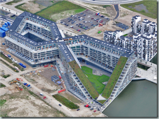
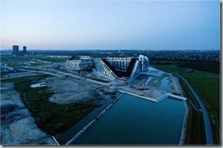
![clip_image004[6] clip_image004[6]](http://lh6.ggpht.com/-PWsEJWTbZac/Ttfd0ULFVqI/AAAAAAAAB74/RTcl4t-A4po/clip_image0046_thumb4.png?imgmax=800)
